Understanding Google My Business & Local Search
Is Grey the New Red for Google Places?
For a more detailed analysis of this change see: Grey Pinned Results Now Live
Since Nyagoslav of Optilocal first spotted the grey pinned local results a week ago, there have been a number of other sitings of the change in the wild. There is still a fair bit of variability in the layout and arrangement indicating that Google has not yet picked a final design and they are still testing. The widespread sitings would tend to argue that ultimately the change to grey is likely.
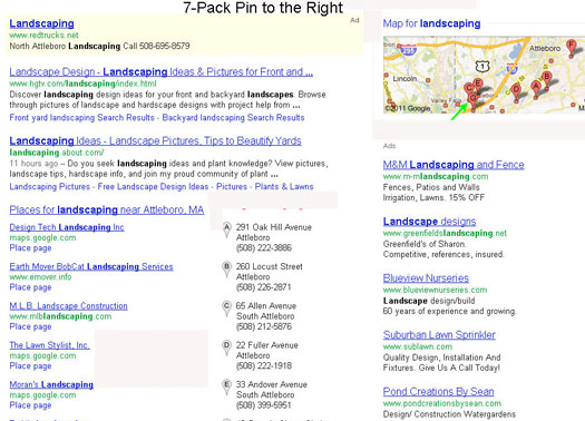
Here are screen shots from Optilocal, LocalBusinessRockstar and LocalvisibilitySystem that capture some of the variety still presenting. Besides the grey pin, you will note that on some screen shots the pin has moved to the right. Most significant to me was the change of the Branded One Box. In moving the images to the right, Google is reducing the space given to a brand at the top of the page. We still need to see this result with SiteLinks to ascertain the full impact.
Click to view a screenshot slide show of the range of grey pin results that have been spotted:
The potential change to grey is interesting. We know from eye tracking studies of local results, and intuitively understand, that the Red pins are very compelling to the searcher and attract their focus. We also know that Google has stated at the Senate hearings that the local results actually decrease Google income by some percentage.
Google has invested significant marketing resources into the Red pin with a bevy of marketing campaigns. As a result, the pin has become an incredible icon for the brand, achieving worldwide recognition as a symbol of Google’s local search capability. When you see the Red Pin you think Google Maps.
It strikes me as odd that Google would mess with that strong branding of the image but it is possible that a change to grey in the main search results is an attempt to amerliorate the negative impact that local search has had on ad income.
Your thoughts? Is the change coming? Why would Google fool with the Red Pin?
Update: Wissam Dandan of LEBSEO Design has put together this video. Note that the grey pins turn red when you mouse over them:
Here are the original postings & summaries of the grey pin discoveries :
*CatalystMarketing’s summary
*Optilocal
*LocalBusinessRockstar
*LocalvisibilitySystem
For a more detailed analysis of this change see: Grey Pinned Results Now Live
© Copyright 2025 - MIKE BLUMENTHAL, ALL RIGHT RESERVED.


Comments
21 Comments
Hey Mike,
Thanks for the mention. I was wondering how you’d weigh in on this latest salvo of changes.
You may have answered one thing that puzzled me: why Google didn’t change (or rather didn’t *test* changing) the pins on the right to gray. Fine, potentially they’ll change the pins in the 7-pack and blended results to gray, but may keep the “iconic” red pins on the map itself. It seems one possible way of Google having their cake and eating it, too.
On the other hand, if Google changes over to gray pins, the blue Adwords Express & classic Adwords ads would become giraffes among zebras–which might make those ads more enticing to business owners.
Do you think that the re-orientation of the map on the right (from portrait to landscape) is part of (to use your words) Google’s effort to offset “the negative impact” that local has had on ad income? To me, it would seem so, because if the map is fatter but shorter, that allows maybe one PPC ad on the right to *rise*, above the fold.
@Phil Although I often figure that its a good bet to follow the money.
Obviously speculating about rationales from within the world’s blackest box, it is just that, speculation.
The lack of change of color to the Adword/Express pins would be consistent with the theory that they are attempting to increase ad income… particularly if at the top of the page above a blended result.
I do think the reorientation is an effort to fit more information above the fold, both organic results AND paid ads.
I personally find that the dual colors for the local pins creates a disjointed visual between the local results and the Maps… some of that might just be familiarity but some is design aesthetic.
Thanks for the mention, Mike.
I think everything Google is tweaking in terms of SERP design in the last few months is related to increasing their revenue and that is normal after all. I mean they are gradually transforming into a large advertising agency offering both advertising options and the main platform to display them.
While I’ve seen just a handful of screenshots I can definitely say that this way the Google Places results would get much less attention. Thus Google probably aims to revert some of this attention to the paid ads. I also agree with Phil on the layout of the map.
It is truly interesting that Google practically sacrifice to some extent their marketing and branding efforts on the red pin symbol, in an attempt to get more revenue from paid ads. A little sad, is it not?
Hi Mike,
I think Google is messing with the red and grey for conversion and profit purposes. They will probably roll out a change in AdWords where people have to pay to get the red pin.
Imagine if only one company per page can get the red pin. It would change the dynamics of CTR for local search results.
@Nyagoslav
Take a look at the video and new slides that I added from Wissam. They show that the grey becomes red with a mouse over. So it appears that a place will get attention if you give it attention. If not going to increase click thrus, at least it is visually more cohesive.
As to whether it is sad, I am not sure. This is capitalism and the prize goes to the biggest baddest profit generator. We should not delude ourselves that Google is its own master…. they serve the market just like any other company. No emotion lost on my side.
[…] more discussion see Mike Blumenthal’s blog or Optilocal. Related EntriesGoogle Launches "AdWords Premier SMB Partner Program" Google: Local […]
Huh, yeah, I think I agree with what Jey is saying. I was at Google offices in Pittsburgh not too long ago for a business networking/”learn about Google” function and they were handing out little red stickers of the location marker. They are marketing that red location marker like crazy, so changing it to the grey isn’t about reducing it’s importance, but more likely increasing the importance of the red mark.
@Jey
That certainly makes sense. The “customer focused” argument would be “We are doing to not distract the reader”. I tend to think it weighted towards your argument.
@Jami
You comment “so changing it to the grey isn’t about reducing it’s importance, but more likely increasing the importance of the red mark” makes all kinds of sense.
When I saw Wissam’s video that became more obvious. I was having trouble reconciling the grey and the red but with a role over highlight it provides the continuity while still making more links both paid and free visible on the page AND makes the red and blue more obvious.
Soon be time for a new heat map.
Hey, guys, speaking of the “Color Pins” – Have any of you received an email about the “Pink Pin” from Google? They are doing a benefit for breast cancer and are asking businesses (that are registered in Places) to sign up — I’ve only seen it come through for my one client located in NYC.
http://www.pinkpin.com/
Jami
It was announced on their SMB blog about 2 weeks ago. It is only NYC.
Have not seen any grey yet or pink. Would not be surprised if they scrapped their red pins – especially after they’ve created a brand around it. That’s how this machine rolls. Just when the average joe understood what the red pins meant!
@Jeffrey
Pin is NYC only so you are unlikely to see…and the grey are few and far between… I have not yet seen them either. I am jealous of those that have.
I find the grey less than optimal. To my eye, it looks greyed out, as though you can click on it. Strange.
BTW, have you ever eyedropped the color of the ‘red’ pin. It’s actually a sort of vermilion pink. It looks red, but it’s not.
Oops…should be ‘can’t’ click on it.
@Mike
Yeah, the different map colors definitely do produce a disjointed effect. Maybe it’s intentional: if Google doesn’t have its “colors” plastered everywhere, it doesn’t seem like as much of a monopoly
I’d be interested in knowing how you figure that the wider map on the right would allow *organic* results to rise higher above the fold. If the map is wider, then the organic SERPs become narrower. Sure, you’ll often still have 1-2 organic results above the 7-pack, but everything below the 7-pack would seem to get pushed down.
Not to mention the fact that the new 7-pack seems larger in area than the old one (I’ve been too lazy to measure it, so someone please correct me if in fact the new 7-pack in fact is *not* bigger than the old one.
Anyway, that’s a long way of saying that (as you said) the paid ads would float up a little higher, but that I’m not seeing how the same could be said of the organic results. If anything, the organics seem at risk of being altogether pushed down–which would comport with what we’ve been saying about how PPC is at the center of this.
@Phil
The area I was referring to above the fold was in relation to the Onebox. You are right a 7 pack flows down the page and the orientation does affect organic but it does likely affect ads.
Hey Mike,
As always, thanks for the great insight. Wanted your opinion on this..
Do you think Google will utilize the red pin within the products for their local advertising customers to help address the “disappointing” revenue they’ve experienced within Places? Like you said, the red pin is compelling (and familiar) to the searcher and attracts focus.. could pull much more weight than the purple Adwords pin.
It’d be a great mistake and chances seem slim but I could potentially see them going this route, what are your thoughts?
Thanks,
Matt
The attack of the Grey Pins has just landed in Colorado. Also any reference to 3rd party reviews have vanished completely. POOF!
Not sure what to think of this.
[…] has upgraded their local search results and the Grey pinned results are now live. Note in the screen shot that the branded One Box search now shows either 4 images or […]
I think it is more about highlighting the star reviews. All signs are Google is going more social and we know how they are trying to promote their own reviews given the recent Places changes. All of Google Design changes of late, gmail included follow the “less is more” with key buttons standing out on the page using color. If you make all the pins grey then what stands out are the yellow star ratings.
To me this is more about the star rating being more prominent which follows their previous changes.
[…] suggest that part of the reason for the major interface update in July – and ESPECIALLY the one in October which shows Place Page data but still directs clicks through to SMB websites – was due to […]
Comments for this post are closed.