Understanding Google My Business & Local Search
Is Google Local Changing the Metaphor For Local Ranking?
For as long as Google has displayed local results they have done so with a modified Yellow Page listing approach albeit one that ranked by prominence rather than distance or alphabetically.
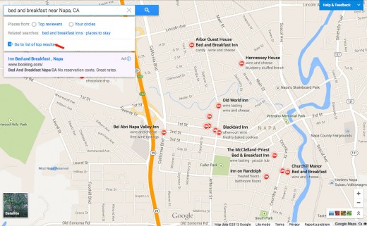
With the rollout of the new Google Maps preview, the loss of the Places search link & Places search from the main page of Google and the recent tests of the carousel for local hotel results, one has to ask if Google is moving away from rank ordering in an A-G list so prevalent over the past 8 years of local to a flatter, more review centric view of local listings.
The new Map view of businesses is striking in its attempt to force the user to pick a particular business based on its overal relevance and prominence within a given geography. The geography is the metaphor not a list. The list view along the left side of the display, once as equally as prominent as the Map, is now relegated to being located at least one click further away. It is not very visible once a user starts clicking on pins and is unlikely to be clicked very often. Admittedly Google is still ranking the results as they are showing 12 accommodation icons and 8 business names in the results to the exclusion of all other listings but Google is no longer readily indicating that they think one business listing is superior to any other within the display.
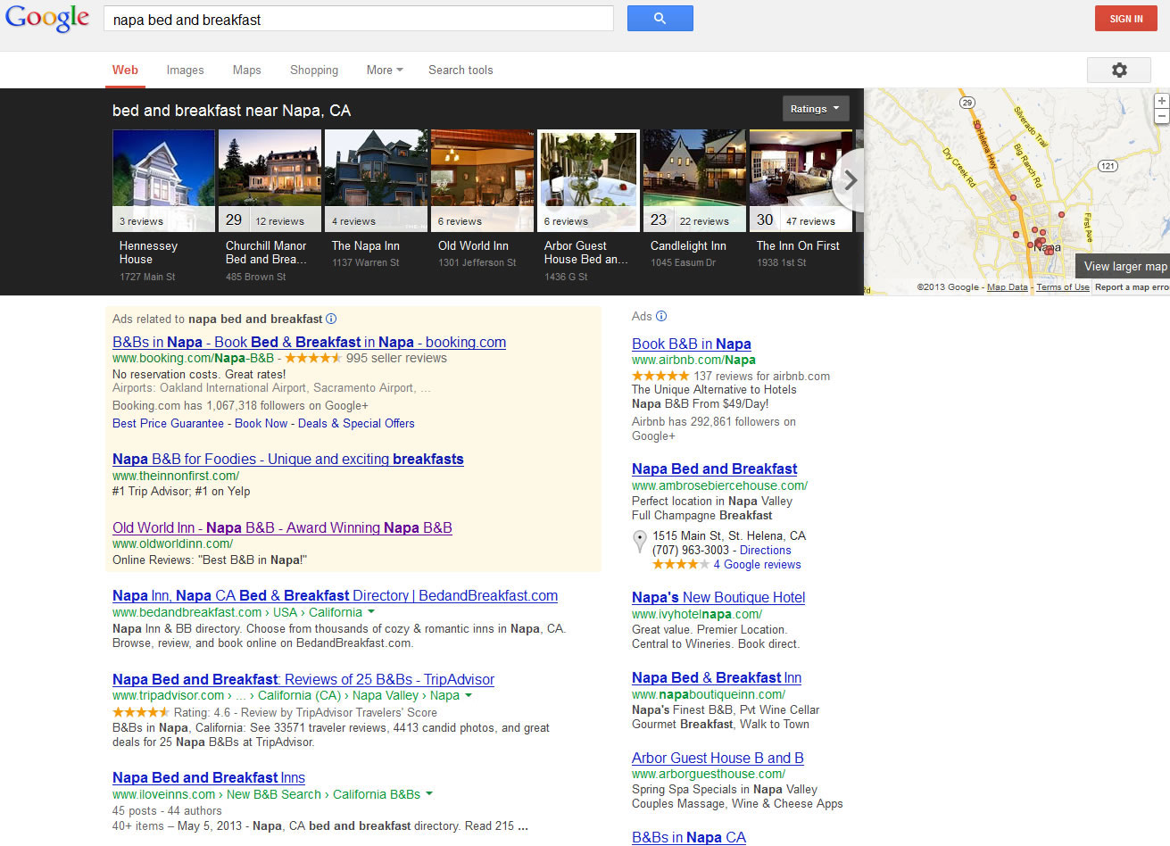
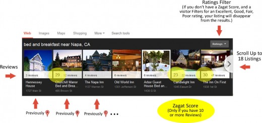
Equally intriguing is Google’s testing of the carousel display for local hotel results (courtesy of Lisa Kolb of Acorn Internet Services). This display “flattens” the local results and puts nearly equal emphasis on each of the top 7 results. The return of organic results so prominently on the page are also fascintating. Results 4, 5, 7, 8, 9 and 10 are the organic pages for the B&Bs showing at the top of the page giving each property two shots at the searcher. I have no idea how click through rates are influenced by position in carousel results or how users react to the pages being repeated in the organic results below. However the images at the top are very eye grabbing and unlike a list display typical of the 7 -Pack, it seems to me that a click on the middle or to the right is as likely as a click on the first result.
(click to view full page)
As Lisa Kolb pointed out in her article, the Zagat rating in this display (and one presumes a big, fat red star when Google makes that switchover away from Zagat) will be a primary attractant to the user.
This change is very consistent with Google’s new card focused design aesthetic that we are seeing in Plus, Glass and Now as well as the new Maps. Can it be long before that new design change and a non list view of rank hits the front page of Google?
© Copyright 2025 - MIKE BLUMENTHAL, ALL RIGHT RESERVED.


Comments
25 Comments
This is just a guess on what may happen, but I’m predicting that they will move all local results to the carousel view and removes the pin markers from the SERPs we’ve all grown accustomed to. If they move to a horizontal scrolling carousel, that will free up room on the page for more ads. If Google gets rid of organic results then people will flip out, but if they relocate the local results to the top of the page I’m not sure people will have as big of a problem with that. More space on the page = more ad revenue for Google.
That’s my thinking about this. Not sure if that will be the case or not, so we’ll just have to wait and see what happens in the next few weeks/months.
@eric
Google has long said that they forgo ad revenues with the current local display. This could very well solve that problem.
Great info! Asking if user wants personalized info ought to get a lot of businesses using Google+ quickly.
BTW, I pinned this
Am in the UK and in the accomodation provider niche. We are yet to see any carasual type listings over here.
It seems whatever format the US gets it arrives here around 2 years later.
Mind you there has been a huge emphasis on + listings in the last couple of Months and those businesses with an active + page will rank better. One other thing I have noticed is that recent reviews influence ranking better than aged older reviews even if the scores are higher.
Did I not read somewhere they were discontinuing the zagat system reviews?
@KB
Hopefully you read it here.
Hi Mike
Great to read your interpretation of the current events – the horizontal listing does indeed sound like a better way to utilise the space to allow more of something else
Like KB said, we’re still not seeing the carousel for hotels over here.
And I am grumbling because I only just got my Zagat style rank and now it’s going to disappear again! Which is what happened when I got my five stars on the old system and they made all the changes and I lost some of my reviews and didn’t make the grade for Zagat until I could educate my lovely fans on how to reclaim their old review. Fingers crossed my stars will reappear seamlessly this time!
With Best Wishes
Jo
@Jo
Don’t feel bad. At this point, the carousel is still not being seen by many on this side of the pond… I just happen to think that it is likely to come around as the display at some point in the future. If you recall they tested the return of stars as long ago as last fall so it could be a while.
As to the loss of Zagat… I don’t think many besides you will miss it… I do think that long haul the increased granularity on restaurant reviews was and would be helpful but in other areas it was a pain…
I think you answered your own question, Mike: They’re testing, and will continue to test. People generally like the top-to-bottom, A-G rankings, so if that layout does get replaced by a more “horizontal” system, I think it will only be after Google has tested the waters more – a lot more.
But then again, we know Google’s track record of ramming changes down users’ throats…
Just to put on my tin-foil hat for a second, I wouldn’t be too surprised if Google eventually replaced the 7-pack area with PPC results for local businesses and put the horizontal, review-centered local results somewhere else.
@Phil
Actually I think we are seeing more than a test. I might be wrong but I think the carousel will roll out and the only question if its a limited number of verticals or across the board.
I could see that. Although if you are wrong, rest assured that I’ll blog about it
@phil
How
Much time do I get? Beauty of predictions is that if they haven’t happened yet it will always be tomorrow and if they do then I am a friggin genius eh?
Funny I literally just had a conversation with a client and predicted this to be the route they are heading before reading your blog! The underlying problem is that Google’s local info, outside of the main user interaction categories ie restaurants and hotels, is pretty weak. There are a number of verticals where their data is complete rubbish. Will be interesting to see how this plays out.
I wonder how this will affect “Google Offers”. Little blue tags just on the map or in the carousel? Does offers functionality currently exist? Does anyone even care? Will this go the way of hotpot/boost/tags/whatever else they called it? Or will this become cool now with the new layout?
@jeffrey Google Offers is front and center and hightlighted even more strongly on the newly re-designed Google Maps that’s coming out soon. So don’t think it’s going away, at least not now.
Here’s an image from my Maps Update post showing one type of “Offers” display that shows up right on the info card. http://localsearchforum.catalystemarketing.com/attachments/google-maps/717d1369153301-4-critical-google-maps-changes-will-impact-mapsnewbest.jpg
Hey Mike! Interestingly enough, I did see a slightly different layout for “Napa bed and breakfast” search where the local carousel spanned the full width of the screen and the map was not displayed. It gave you 4-5 more slots of individual businesses. (And of course, I didn’t get the snapshot!) Time will tell!
@Lisa
Regardless it implies to me a non linear approach to ranking… ie “here are a group of businesses we think you should look at” approach.
@Jeffrey
I agree with Linda on this. The new iOS G+ app also includes offers.
Google do have all new ranking system. To show it, it depends in several factors: city included in the query (yes/no); zip or near included in the query (yes/no); how many results are in Google list and their quality, and more (do share!).
Here I annotated these changes:
http://www.search3w.com/images/New_Google_Places_ranking_2013-05-29.png
Well what can i say Mike, big change if it becomes permanent!
Look forward to seeing how this goes in Australia and will report to you if i see anything different.
Larger map is great for many purposes, but a listview is more beneficial in many situations when you are looking for options. I think it was said well by someone at Google IO, to paraphrase:
New Google Maps is like Window 8; do we really need to change all these design elements; can we go back (to XP)
http://www.localsplash.com/local-maps-seo/a-stroll-through-the-new-google-maps-interface.html
Thanks for the great article, Mike!
Looking at this from a user perspective, having scrolling photo results would be awesome for so many industries! Just recently I was looking for a spa nearby, and had a hard time finding one highly rated with any photos.
If I was looking for a doctor’s office or lawyer, though, I’m not sure this type of results based on beauty (photo) and online reviews (where client privacy is important to many) will be the most helpful. It will be interesting to see if these new results are shown for every industry when it’s rolled out, or if they take it slower and introduce only industries like hotels and restaurants.
@leanna
Great points. So far google has shown the photo based carousel results in a limited range of industries. It could very well roll out just for those where google has lots of photos and benefit from the visuals.
@Mike
It would definitely simplify certain types of searches! I’d rather scroll through images of restaurants than click into each to find out if the ambiance worked for a certain occasion! Thanks again.
Hey Mike – I think your observations are spot on. I do think the change to remove the list from the default search results is a bad idea. Since its one click away, its essentially like putting the business information on page 2 of the SERP.
Does anyone else think generally, Google is adopting a more image focus? With rich snippets making their way into the SERPS its easy to see why Google is focusing on showing people more images, simply put they work – if the stats are showing Google that more people click on images it makes sense in my mind that Google will continue to experiment with images?
Thoughts?
Comments for this post are closed.