Understanding Google My Business & Local Search
Google Hotel Finder Experiment – A Peak at the Future of Local Search as Interactive Content
Last week amidst the noise of changes in the Place’s layout, Google noted that they would be “Integrating some of the great information that’s been buried on Place pages into your web search experience across all Google platforms“. While Google doesn’t talk much about their thinking or the future, when they do, I have learned that you can take them at their word. They have in fact quickly started this process of projecting data from within Places more broadly, resulting in its higher visibility and an increased liklihood of being seen. They are putting more photos from Places into the branded One Box in the main search results and have started showing coupons from Places in their mobile Shopper app (OMG will coupons finally make their Phoenix like re-appearance after 4 moribund years?) .
The Google Hotel Finder experiment is yet another example that they are taking buried information from Places and Maps and experimenting with making it more visible. In the process they are making search results more engaging and interactive, demonstrating their move from being strictly a search results provider to using search to generate useful content that will attract and retain users. More users, a longer time on the site and a fresh way of looking at previously buried content will obviously also provide additional ways to sell more ads.
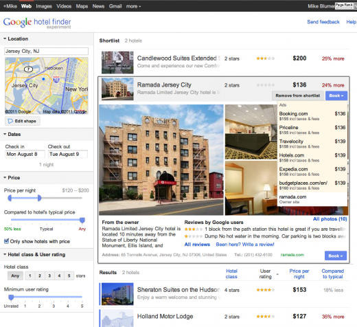
 Rather than the standard Google approach of the single search box and their educated guess as to what searchers want, the Hotel Finder interface, in very un-Google like fashion, provides a more faceted approach to finding exactly the information that a user is looking for. The choices allow for a great deal of granularity of pricing, relative pricing and quality.
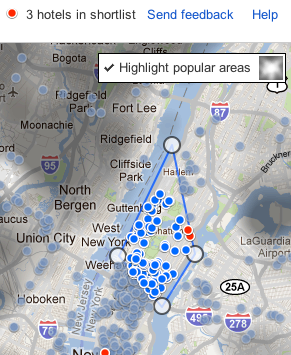
If the broad, single field geo search does not return the appropriate geography, the user can drill into the map and literally outline the appropriate neighborhoods themselves via interactive, draggable boundary lines. The map view provides a heat mapped representation of the most popular areas.
The interface allows a user to build repeated queries with slightly different parameters and save the results into a “short list” of choices. Thus if you wanted to compare hotels in two or three totally distinct non-adjacent neighborhoods, say the Upper West Side, Tribecca and Park Slope, a user could create a custom view of hotels from which to choose and then share the view via URL with another.
More details about a given hotel, a Places view if you will, with a very attractive layout can be seen by clicking on the hotel of choice. The user is presented with an array of photos, review summaries and the owner description. It seems to reflect a new, thoughtful design sensibility on the part of Google.
Of course, it is not just a view of content but offers the option of booking the hotel via their still secretive hotel booking tool. All in all it is in impressive experiment with a subtle transactional nature. It is both more polished and definitely better looking than most Google experiments. It is very slick and offers an interface that could be easily adapted to restaurants, bars, florists and hair salons (to name a few) and of course to mobile.
If this experiment is any indication, the future of search is local search and it is an interesting one. With the acquisition of ITA and Google’s obvious and long standing desire to move into the hotel booking market, this experiment shows how Google is thinking about both the data and the market. Many have explained the recent changes as a reactive response to anti-trust complaints. It could equally be explained as a proactive measure that would allow Google to be in a more competitive position going forward as they compete more directly against the likes of TripAdvisor and Yelp.
The Google Hotel Finder experiment is not just search as we have come to know it but search as interactive content that has the ability to achieve serendipity in both interaction and results. And of course in a way that makes the sale.
© Copyright 2026 - MIKE BLUMENTHAL, ALL RIGHT RESERVED.


Comments
8 Comments
Thanks Mike.
It’s interesting there is no link to the places page (as with map results), only the website.
There are a few listings showing no reviews in the main list, but visible once you expand the listing. I can’t see a pattern yet.
The 2 example reviews shown on the first page seem to be the most recent, so another reason for business owners to keep up to speed on their reviews.
Cheers
Stuart
@Stuart
Thanks for the observations… I did not notice the absence of review content if not current… good catch.
It’s nice as an experiment, but it’s no hotels.com. Hotels and restaurants are great domains for faceted search, and I’d love to see Google embrace this paradigm in all of its glory. The draggable boundary is slick.
@Daniel
1) How would you suggest that they embrace the faceted “paradigm in all of its glory”?
2)No it isn’t hotels.com or TA… part of that though is marketing and positioning of the product… both big struggles in the past for G… think they can overcome their hesitancy in those arenas?
@Mike
As hotels.com proves, there are lots of useful facets that people already use to characterize hotels, such as neighborhood (less flexible than draggable boundaries but easier to specify), accomodation type (1 star vs. 5 starts doesn’t help me distinguish a B&B — which could be luxury — from a corporate hotel), amenties (pool? jacuzzi?), etc. In general, it’s hard to obtain this kind of faceted metadata for the open web. And sometimes it’s hard to organize it in a fashion that is intelligible to consumers. But hotels and restaurants are ideal domains for a rich faceted search experience. By being so spartan, Google is almost reducing the hotel selection problem to price, location, and availability. I’m sure that’s good enough for many, but it is a lost opportunity for those who have any other selection criteria.
@Daniel
If Google offered hotels a way to successfully disintermediate the OTA sites at a lower cost, the hotels would bend over backwards to give G any and all information any way they wanted it. 🙂
Mike:
What I noticed vis a vis branded searches is that the pictures from the Places page add a tremendous amount of “verticalness” to the information from the site. That absolutely eats up enormous amounts of visible computer screen real estate. Essentially above the fold on one’s computer screen means that one is seeing one piece of information for one business and no other information.
Good or not? Positive or negative? I guess its all in the eyes of the businesses/smbs/hotels that show up in results. If one is first its a feast!!! An incredible bonanza. If one is 2nd or god forbid 3rd in the SERPs its as if one is banished to limbo.
If the branded search is accurate and entirely representative of a single entity that might be fine. If the so called branded search is one that might encompass more than one business….say because one smb/one business dominates serps for that phrase even if its not the business name than it presents a problem IMHO.
[…] morning I spoke of the Google Hotel experiment that made search results into interactive local content. It is not clear if this is the new normal […]
Comments for this post are closed.