Understanding Google My Business & Local Search
Google My Business App Receives Major Facelift
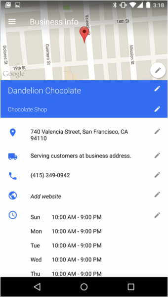
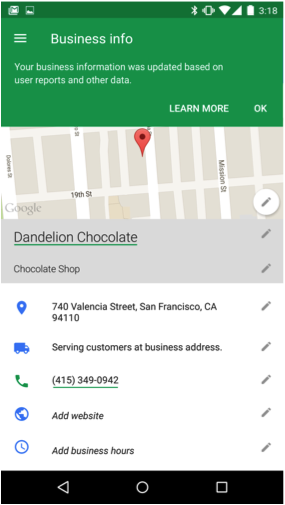
Google is releasing a new app today on Android and shortly on iOS that upgrades the mobile Google My Business experience.
The goal of the upgrade was to make the interface and visuals more similar to Google search and provide better feedback as to error states.
New features:
- Improved Editor
- Easier to find your listing on Maps and search
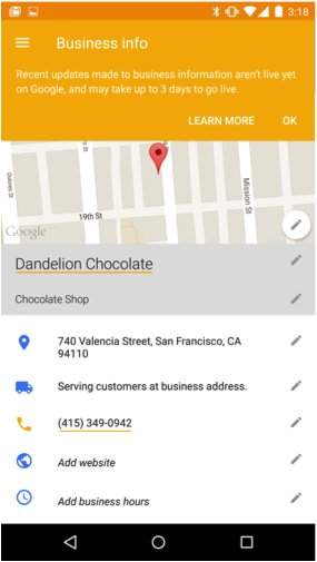
- More Detailed pending and error states
- Listings that are Permanently Closed are now visible via the App
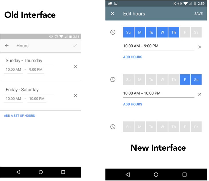
- Improved Hour entry and better support for 24 hour business days
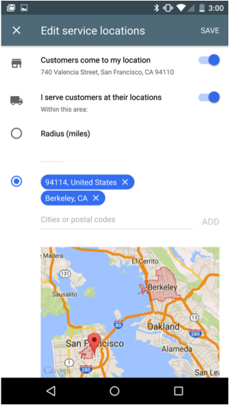
- Creating a service area display is more intuitive and the Service area display now matches Maps
- Help is more visible
The upgrade is elegant and from the demo I saw, it seems to work well. It makes the app fully functional and on par or better than the desktop interface.
That all being said, it hardly seems enough to recharge Google’s local efforts and attract more SMBs to its platform
Given Google’s recent reduced visibility of local results, the ever present complexity of doing well in search, the rise of Facebook as a small business resource and the demise of Plus as an SMB communication platform, this upgrade, while welcome, seems to be bit of chair shuffling on the deck of the Titanic.
While this tool is likely to be easy to use by the SMB it does nothing to highlight the benefits of Google local search and make it clear to the business owner how a business will really benefit from participating in the project and what they need to do to succeed. And it fails, as the Google GMB has done right along, to provide a reason for ongoing engagement with the product. Outside of answering and monitoring reviews Google has yet to come up with a compelling reason to visit the GMB app or dashboard on a regular basis.
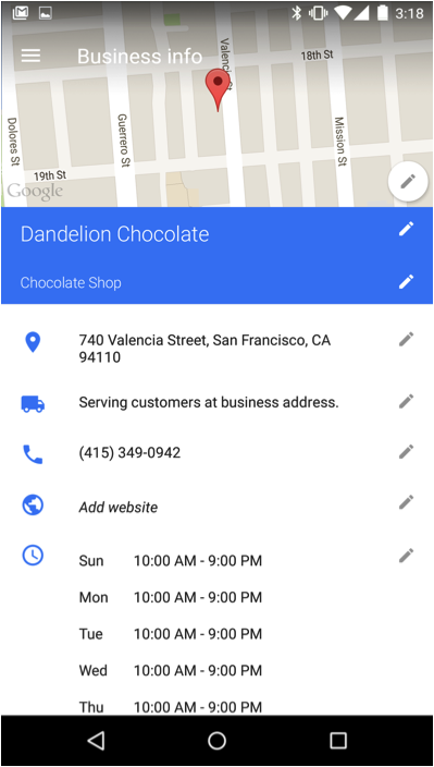
See the screen shots from the new product:
© Copyright 2025 - MIKE BLUMENTHAL, ALL RIGHT RESERVED.

Comments
8 Comments
Wow. That looks really nice. How is the ease of navigation between sections and the editing options?
Very cool. Glad they are finally doing something about this and I am looking forward to the upgrade on OS!
Funny! –> seems to be bit of chair shuffling on the deck of the Titanic.
The bulk of the editing is done on the business info screen (as seen above with the pencils). You just click on a pencil and edit that section. Its fast and easy. Movement is fast and reliable.
Google is very perplexing on this whole area. GMB seems to have become a data repository for business information that is pick through and served up by Google Maps and Search and maybe some other apps they have. I can’t find any reason to interact with it beyond registering information so they can use it. No real need to try to do more from what I see. Why they need to add an android app on top of the mess they already created baffles me.
Hi Mark
It has been the Google conudrum…. they have never provided a compelling reason for ongoing activity. May I ask what you do?
“While this tool is likely to be easy to use by the SMB it does nothing to highlight the benefits of Google local search and make it clear to the business owner how a business will really benefit from participating in the project and what they need to do to succeed. ”
That sums it up perfectly.
“And it fails, as the Google GMB has done right along, to provide a reason for ongoing engagement with the product.”
Agreed 100%. The app’s promo cards, where they should be getting those ideas across, are pretty wimpy:
Display the right info: Keep your business info up to date on Google Search, Maps and more
Check in on the go: Understand how customers find and review your business
Make a lasting impression: Share photos of your business and updates with your customers
(http://imgur.com/gallery/d6RsY/new)
Not exactly compelling.
To those ends, they have decent, minimal charts for phone call volume per day of the week, engagement by post type, and best practices for responding to reviews, but still nothing for setting seasonal hours (outside of just temporarily changing your hours) and no best practices cards for a lot of subjects that could use them (like choosing your categories and service area, the importance of NAP consistency, etc.)
It’s definitely a friendlier interface, but it still lacks purpose for the casual user and depth for the power user.
Why go to all the trouble of making an app for a sinking ship or as you so wittily put it, shuffling on the deck of the Titanic? And they just started “Collections” too. Ok, ok, I’m in denial…but why do they bother and stir up hope?
Comments for this post are closed.