Understanding Google My Business & Local Search
Post Pigeon Geo Assessment – How Did Traffic Change by City
It has been a little over 2 months since the Pigeon update. And while quality issues continue, with some listings taking a hit and others gaining, Barbara Oliver & Co Jewelry seems to have netted out with slight gains in web traffic similar to what she saw immediately post update. Her total web traffic was down but her in-market traffic has shown a 5% uptick in the cities surrounding her in NY State and 13% gain in nearby markets in Canada that frequently shop in the US.
It is difficult to impossible to assess her MyBusiness analytics to know how things worked out on that end, given the inability to compare time periods and the lack of detail in the reports (boo to Google on this front).
As I noted immediately post Pigeon, Barbara had stopped showing in the 7-Pack on strong Buffalo centric head term searches in Local Pack like Jewelry Buffalo (although she and 2 other strong jewelers continue to show above the pack in organic). Thus I was curious to dig into the geo data to see where exactly the increases were and if there was a discernible geographic pattern to the increase.
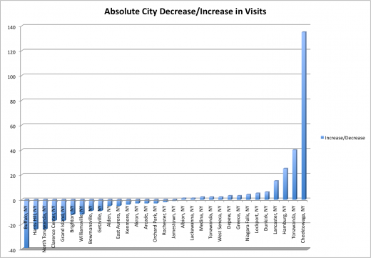
You can see from this chart that web traffic on from Buffalo has decreased by 37 uniques when comparing the time period before Pigeon to the time period after, dropping from 258 visitors to 221. That was more than offset by increases in visits from suburbs just to the south (Cheektowaga) and north (Tonawanda) which saw 154% and 52% increases respectively.
Using the new My Maps, I exported the differences by city and plotted them.
It is somewhat easier to see the major shifts geographically if you zoom in although even there it is difficult to ascertain an obvious pattern. Given the lack of keyword data it is impossible to tell exactly what terms are driving the traffic in each city.
It seems likely that the extremes (Buffalo, Tonawanda and Cheektowaga) seem to be driven by new geo results within Pigeon. Those cities with smaller changes could just be normal variation or could be driven by changing results due to the update.
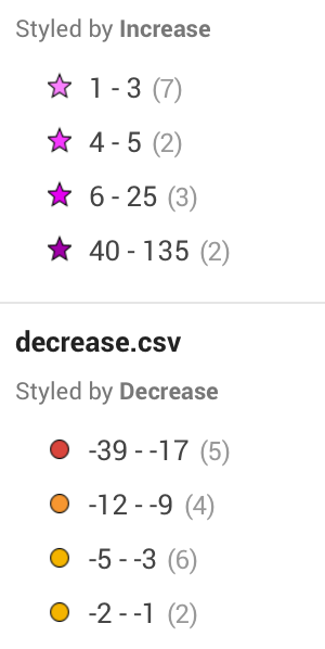
 Key –
Key –
Purples Stars = Plot cities that increased
Red/Orange circles = plotted cities that decreased.
Barbara’s location is the black pin.
One of the “features” of Pigeon was to localize results down to neighborhood level. This meant a narrowing of reach so that those in the suburbs were often left out of city wide searches. This, for some, was offset by searches in in the nearby suburbs or neighborhoods. Cheektowaga is a mostly residential area with little high end shopping. It is likely that Barbara Oliver is one of the closest jewelers in that context. Clearly the decline of Buffalo based searches was due to the decreasing radius of Buffalo based searches. But that assessment raises the question of why did Barbara loose traffic from her “hometown” of Williamsville that has both residents and high end shopping and the even bigger drop in the next neighborhood to the east, Harris Hill?
I think plotting this geo information can additional nuance and understanding to your search results. I am not sure that it better helps to understand Pigeon although it does demonstrate some of its affects.
© Copyright 2025 - MIKE BLUMENTHAL, ALL RIGHT RESERVED.

Comments
4 Comments
Perhaps this is related to voice search. “Cheektowaga” sounds suspiciously like the sound made but someone briskly walking after butt-dialing someone.
Seriously, here in Austin I’ve compared notes with other small businesses. Before, “Austin” would take in the entire region. But there are a bunch of suburbs to the north (Round Rock, home of Dell Computer being one of them). We are even getting neighborhood-level location settings in Google.
The results now seem to be skewed by distance for whatever x-pack you end up with. Not by geo name per se. We live right on the edge of Cedar Park – Austin. A search for the post office, for McDonalds, even our local HEB grocery – sends us to Austin locations. On the north side of Cedar Park, [oh, Google map it already :-)] you are shown Cedar Park locations. Its even more pronounced when you are on your phone. Google appears to be doing distance calculations. Unless you specify a geo location your results are influenced now by what is closest to you.
@sandy same in my experience which raises the questions of why the actual neighborhood she is in is down while an adjacent neighborhood is up?
While I can see the usefulness of providing these ‘distance from’ type of search results, the lack of coherence with regard to ‘geo added’ search results is disappointing. If someone is searching for “name of city: service”, I’d prefer to see results that were not pulled from some ‘distance from’ algo… just saying.
As to why Barbara is not doing as well in Williamsville and Harris Hill – good question.
@Andy
Unfortunately we no longer have geo modifiers as we don’t have keywords.
That being said I generally make the broad assumption that these geo searches do NOT include geo modifiers whereas I assume that out of market searches (ie Canada) probably do.
But who knows. Given that we can’t see what people in Harris Hill or Cheektowaga were searching for we have to infer whether they were qualified by other criteria.
Comments for this post are closed.