Understanding Google My Business & Local Search
Grey Pinned Results Now Live
Updated: 10:30 pm
Update: 3:00 am
Update: 11/2 11:00 am
Minor Update: 11/3 8:00am
Google has upgraded their local search results and the Grey pinned results are now live. Note in the screen shot that the branded One Box search now shows up to 4 5 images or a streetview and 2 images, although it depends on how many images are on the Places page. Google now notes that there may be two streetview images, an exterior AND and interior view. The grey “Feedback” link at the lower right takes the user directly to the Report a Problem input screen.
Essentially, Google is now surfacing the whole of the Place page content (what is left of it) on the main page of Google with the exception of the description. In the case of the branded search immediately, in the case of the blended and 7-pack results when you mouse over the -> to the right of any listing. It surfaces virtually all information in the Places page including up to the 5 photos AND a thumbnail of the home page.
In July when Google suggested that they would integrate some of the great information that’s been buried in Places it was hard to imagine something quite so bold as this. If users won’t go to Places, bring Places to them. It also puts the stripping down of Place page content into a bigger context, no more than can fit on the front page of Google.
Here is a slide show of various new views of local:
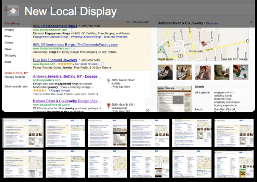
Thanks to Jeffrey Manger of TrumpetLocalMedia for the head up on the fact that this was rolling out. It broke just as I was getting ready to give my Getlisted Google Places presentation. I did the presentation twice today and it is ironic that a presentation can be outdated between the first and second one.
Here are more focused screen shot comparisons with some notes…
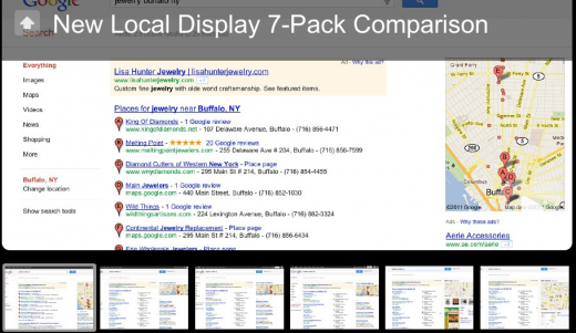
7-Pack Old Vs New Screenshot Comparison
Apparently the Grey Pin Upgrade is still rolling out. I am able to see the Grey Pins on Safari but Chrome is showing the Red Pin. The following images should the difference between the the Red Pack and the Grey Pack.
Several things of note:
-The Grey pack actually takes up MORE vertical screen space than the Red pack, despite the shift to the more rectangular map on the right.
-In the new Grey pack the Map, while continuing to display the same geographic area, actually gets larger as you increase the width of your screen. There appears to be three different Map sizes.
-Claimed listings really shine in the new environment. Google continues to show the Map but will show the webpage thumbnail if there is enough screen width, hours, transit stop, review links and when available, the sentiment snippets.
-The pin changes to Red and the Right Arrow are visible when mousing over any part of the listing
-In some ways, the change makes it HARDER to get to the actual Places page on claimed listings. As you move right and surface the arrow the choices allow the user to click on the Map which takes you into Google Maps, click on the website or read the additional review.
Click to view this slide show comparing the the old and new 7 packs on the same search:
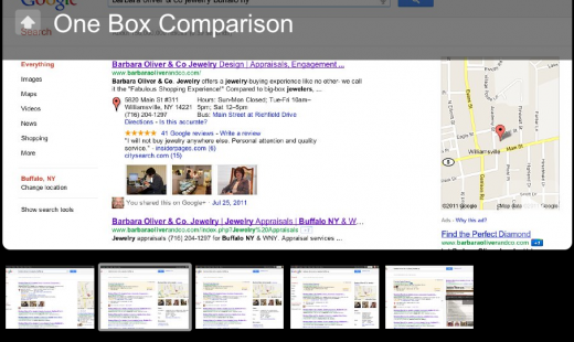
Branded One Pack Comparison Old vs New Grey Pin Display
This slide show compares the Red Pin Branded One Box to the new Grey Pin ones. Several things of note
– Unlike in the 7-Pack, the site thumbnail is only visible and shows by itself when you mouse over the right arrow
– The number of photos displayed depends on the screen width. Google will show up to 5 if they are there and the screen is wide enough. As the screen size decreases, Google reduces the number of images that show
-The Adwords Express Ad shows a grey pin in the new display (the Blue Pin would show on the Map but is covered by the Red Pin). As noted in the comments, that throws out the idea of giving an additional visual boost to the ad
– Again, the description does NOT show only the sentiment snippets.
Here is a screenshot comparison:
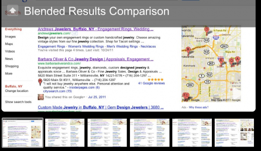
Blended Comparison Old vs. New
–Linda Buquet pointed out in the comments that the meta description is significantly shorter in the new Blended results
–Phil Rozak noted that the Pins in the Map segment are hot and surface review stars and review sentiment when moused over
Here is the blended results before and after slide show:
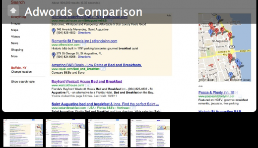
Blended Comparison Old vs. New Adwords
-When you examine adwords, adwords with local extensions and Adwords Express, as Will Scott pointed out, the calculus changes
-The local pins on the ads are somewhat less visible than before in the ad but perhaps slightly more visible on the map
– However, Google is able to show 20-25% more ads on the right margin providing a boost to inventory space on the critical space above the fold on the first page of results. 20-25% more inventory on the two billion local searches adds up to a significant dollar amount.
– The regular adwords, because of the greying of the pins are now on more equal footing visually.
Here are some screen shots showing this affect:
Some quick take aways:
-Google continues to push organic results further down the page.
-The change did NOT highlight ads to any greater degree than before with the Pins, in fact perhaps less so.
-However, they are now able to show 20-25% more ads than before.
-It seems to me that surfacing virtually all of the Place Page information in the main search results will mean less visits to Place pages.
-If you had any doubt about the Place page being a search result, this should dispel that thought.
-The choice by Google to show the algo generated sentiment snippets and the lack of an owner provided description says what Google thinks about everybody’s entered description (hint: they think they are crap).
-Google really, really meant that they would be surfacing the hidden Places information
Where else can they surface?
© Copyright 2025 - MIKE BLUMENTHAL, ALL RIGHT RESERVED.
Comments
38 Comments
Still not live for me but I guess the grey color will slightly decrease the CTR of the listings.
[…] Mike B. is now reporting that the gray pins are live. However this isn’t true across the country. Perhaps it’s […]
Damn you. I thought I’d beaten you to it with this, but when I look at my Twitter feed, you got there by a whisker. Here’s my sceenshot from the Uk ahref=”http://t.co/OIChF2lR”>New Local Results
I’m still seeing the old style one box with red pin and images in the main column, not on the right. Been checking all day for these and other changes I’ve been researching. So I guess it’s still rolling out?
Here in Southern California we are reporting to see the new results. Google places was down today sporadically… so we figured something was coming. We couldnt login and it was throwing a 404 error. Thought we could report it first …..missed it by 33 minutes
Here in Massachusetts, at least, the rollout of the gray pin was weird. Didn’t happen at 3pm today. 15 minutes ago I was looking up the rankings of one of my clients, and the pins were read. 5 minutes later I check the same client and the pins are gray. Obviously a whole bunch of different rollout times in different areas.
I don’t know if anyone’s mentioned this before, but I just noticed that the PPC pins are also gray now. I’m thinking this kind of destroys our theory about making the PPC ads *pop out* more…although when you hover over the now-gray PPC pins, they turn blue…
Not only when you hover over the gray pins do the pins turn red, but if you hover over the red pins on the map to the right, the gray 7-pack pins will turn red. Maybe this, too, was there before, but I certainly didn’t notice it a couple of days ago.
At least color isn’t totally dead in Google Places (yet!)
I was just coming to say although I’m in Socal too I feel left out cuz I’m still seeing red. POOF suddenly my world is gray too.
So is everyone seeing the Gray Pins, address and phone on the right instead of left too?
I think I see another difference too. Off to check some recent screen shots to compare.
Hmmm, I’m still seeing red on the left with Chrome. Gray on the right with FF, wich is kinda nice for comparing. So I was able to prove one other difference.
The meta description on the new layout is cut way short. Here are the 1st 2 results for Seattle Chiropractor
A OLD RED
Downtown Seattle Chiropractor, Dynamic Chiropractic Clinic, Dr Peter Carr is one of Seattle’s most reputable chiropractors. With hundreds of positive reviews
A NEW GRAY
Downtown Seattle Chiropractor, Dynamic Chiropractic Clinic, Dr Peter Carr is one of Seattle’s
B OLD RED
Seattle Chiropractors at Devine Chiropractic Center in Downtown Seattle offers chiropractic treatments for auto accidents, spinal adjustment, back injuries, sports
B NEW GRAY
Seattle Chiropractors at Devine Chiropractic Center in Downtown Seattle offers chiropractic
So descriptions are 7 – 9 words shorter in the 2 listings above.
Plus the review snippets are gone.
@Todd bummed though that my talk on Google Places was outdated 5 minutes before I gave it.
I had to steal Matt McGee’s laptop and hope that the speaker before didn’t finish too quickly…
@Linda
I am seeing the new results in Safari but not yet in Chrome (go figure) so (because of your experience w FF) I went back and compared the before and afters.
I am seeing sentiment snippets in both the 7-pack and the blended.
@Phil
Good catch…
I can tell what this branded “place surface” change does do. It showcases Google place page issues. I have a client in a major market who’s place page displays their competitor’s phone number – Though Google’s direct communications over the last 6 months have stated the conflation issue has been “fixed”, the problem remains. Can’t wait till the client sees his branded search result later this morning when the west coast wakes up.
@Mike,
I question your statement regarding the prominence of ads.
In the initial SERP view the map is more vertically compressed and I think the right margin ads have slightly greater impact.
With the organic being pushed down, and the floating map or places inlay I think the top 3 ad positions become that much more important as well.
Will
Having a nightmare trying to post here these days – have I been blackballed for pointing out the grey balloons?
I’m just glad that it’s now been proved that I wasn’t going mad when I first saw the grey markers and pointed them out to Nyagoslav. If you knew how long I spent fiddling with my addons to Google Chrome to turn the grey balloons back to red!
@Jon As I learned at the weekend, you have to get up pretty early in the morning to beat Mike
Hurrah, at the fourth time of asking, it worked!
Mike, I don’t suppose you have a ‘receive posts by email’ function so that I don’t miss any of your valuable info? I’m not very good with Google Reader, email is where I’m at all the time
Weird I’m seeing RED again. In all my browsers it switched back to the old style.
Funny. I had dreams about SERPs and map pins all night. One time I checked and they were red. Then gray. Then the next time I checked all the titles were in Chinese!
@Linda
Dreams about map pins…priceless! (Boy, can I relate…)
Or maybe you’re a prophet: maybe Google will roll out Chinese-language map pins, just to mess with us.
@Will
The comments referring to adwords was specifically in relation to the impact of the pin color and a conversation last week.
I added some more screen shots above and you are absolutely correct in the fact that Google added more adwords space. They essentially increased space above the fold by about 25%… allowing them to show one or two more ads.
@Jo
You can get an email feed here
@Linda I am still seeing grey in Safari and red in Chrome on the Mac. I didn’t have dreams, I just didn’t sleep last night. Between getlisted and this… too much excitement.
@Jim Ryan
Let’s hope that the new support structures Google is putting in Place solve these problems quickly
@Todd Bryson
I figure I was hired to get this news out quickly. I have the benefit of having people all over the world email me. I starting getting the first emails about 10:30 EDT and by 2:45 had received confirmation from 3 additional locations around the world.
On the Canadian border… this is what I’m seeing… searched for the term “ottawa photographer”
Chrome (google.ca) = red pins but new layout with scaling map size based on browser size
Chrome (google.com) = red pins but old layout blended results
Firefox = grey pins with new layout
Firefox = grey pins with new layout
So it’s still rolling out
It’s all Gray here in Vancouver, Canada (both the weather and the pins), I like this new setup
Per Jackson Lo’s report, I checked with different browsers, and noticed a difference as well.
Chrome: grey (red on hover) with preview
FF: red with preview
Safari: grey (red on hover) with preview
All results were blended.
HEY GUYS – Check out something really cool. I can’t play with it right now or grab a screenshot because I’m seeing the old style right now.
But I saw this last night (may not remember exactly right so play with it and share, since I can’t right now.)
Mouse over the listing somewhere on the right until you get the right arrows. You know how it used to show a big preview of the web site?
Now it shows a small web site preview, a dedicated map AND A BUNCH OF INFO FROM THE PLACE PAGE. I think there were about 4 images, plus some of the Place page details AND 3rd party reviews and stuff.
So it’s like a Place page preview in a way.
Here’s a screenshot from Jill at SearchInfluence. http://farm7.static.flickr.com/6060/6304114278_6c7eb9834b_o.png
(But that listing evidently does not have images on the Place page because I’m pretty sure I saw some with images.)
And here’s her breaking story from yesterday.
http://www.searchinfluence.com/2011/11/google-places-page-redesign/
Wish I could play right now to check more listings. But some I saw were really loaded and rich with info, so learning what info she pulls from the Place page can be another way to optimize and make your clients listings stand out from the pack!
@Mike Blumenthal. Oh man. I though I was being all stealth. I just now e mailed you about this very testing taking place in CA Los Angeles. It was only live for about 20 minutes here.
Live in Chicago. Surprised that Adwords Express got gray pinned. Sort of washes out that ads. I wouldn’t be shocked to see those change to another color.
@Linda
There are some interesting behaviors. I think that they are captured in the various slide shows I added above.
@Gyl
From a design perspective it makes sense to make the adwords with local extensions grey. While it is surprising, it does put the Local ads on more equal footing with regular adwords ads. Google needs to be assessing ads based on quality not on differences caused by visual differences.
Thanks Mike, can’t wait to dig into the slide shows. I’ve been on phone all day. Just checked and still seeing red here so I can’t test or play yet. Not fair – she gave it to me then took it away before I could play with it.
Weird. Now I’m on my laptop I use at night and see Gray on FF here again like last night. Chrome switched over to Gray on laptop too.
But my desktop on same network still shows Red on both FF and Chrome. I’ve restarted browsers and did hard refreshes on pages.
Strange, not sure why the difference, but I guess it will all will switch to Gray eventually.
Anyone else noticing Adwords at the bottom of the page or is it just me?
http://screencast.com/t/rSSGI61dfA
Google formally announced Adwords at the bottom yesterday. They have been spotted off and on for a while.
Google Goes NON POLITICAL
Mike: I like it. Its not red, its not blue. Its not black, its not white. Its gray. The world is often gray. Its confusing and full of ambiguities.
[…] For a more detailed analysis of this change see: Grey Pinned Results Now Live […]
Feels very Yahoo-esque with the ads at the bottom. Thanks for breaking it down Mike B.
Any idea what is triggering pure vs blended in the new gray world? Also, I’m seeing some blended results showing less than 7 gray pins. Compare:
nyc chiropractor – pure – 7 gray pins
new york city chiropractor – blended – 7 gray pins
san francisco chiropractor – blended 3 gray pins
The SF one is perplexing to me. Why 3? Why those 3?
[…] Google Places (Maps & Local) – Mike – 10:57 am With the rollout of the new grey pin local search results, Google has continued to increase the amount of information from your Places page that is visible […]
Mike, thanks for the mention! It’s been a few weeks now of Grey Pins ~ what’s the verdict? Do you like them? There is a sleekness to the appearance and it’s cool that they go red when rolled over. It makes sense to me and certainly leaves some room for a new offers rollout or something else in a highlighted color in the future. Just wondering if people like the grey pins.
@Jeffrey With that caveat I would suggest that the ease with which I personally transitioned and have nearly forgotten the “old way” is a testament to their design. I, like you, find it pretty slick.
As they say “Opinions are like a#$h*&es, everyone has one and they all stink”.
I would assume but do not know that visits to Places has further declined. Would love to hear how many searchers roll over to the right on a given (local) search result but I guess that info is locked up in the bowels of the beast.
@Jeffrey: Funny this would come up. But yesterday, I asked my wife to do a Google search for Sushi in Los Angeles. I held the kids and watched her. She totally ignored the bland, dead looking, local results, as well as the PPC ads at the top (I think most people assume they are commercial spam) and went directly to the right, to the brightly colored PPC ads that she believed were local results. (BTW totally worthless as most of the dots to the Sushi places were 30 miles away.) Anyways, my contribution.
Bottom line is that on a laptop, she did not even bother scrolling down to look for local results, don’t see em at all unless you scroll. The good thing is, she eventually did scroll down since the Map was more trouble than it was worth, and we found a place close by. But the bad news is, she clicked on three PPC ads first for sushi places that were way too far for us. That means business owners are getting clicks they don’t want or need and, IMHO, losing money to PPC. Business owners beware. Use restricted GEO search. Then cross your fingers?
P.S. So many of the Local results were merged with other Sushi places, (as are my law firm listings as well, since people are using Mapmaker to hi jack the Google created “non owner verified” listings) that it was difficult to call the right place. For example, one LA Sushi Place had a phone number to Sushi place in Glendale and pictures and url’s all mixed up from a Sushi place in Anaheim (And it was now “owner verified”, so no way to use community edits to fix it). Sheesh. So many local results all merged and screwed up, PPC is the only way to guarantee a click in many cases.
Comments for this post are closed.