Understanding Google My Business & Local Search
Google Rolling Out New Upgraded GMB – GMBL Interface
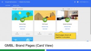
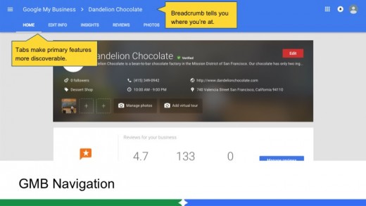
As we speak Google is in the process of rolling out Google My Business (GMB) & the Google My Bussiness Listing (GMBL bulk) interface updates with a logical integrated hierarchy that is consistent across both products. The upgrade provides improved navigation within any section of the product via improved menus (top and left) and breadcrumbs. It is currently visible to some users and will be visible to all over the coming week.
As of today I do not yet have direct access to the new interface and the help files have not yet been posted.
The interface adds modern navigational elements that create a consistency between the two dashboards and increases access to the many features regardless of the number of listings. It is arguable that these basic interface conventions should have been added quite a while ago, here’s hoping that ease of use is a prelude to additional marketing functionality.
Some highlights of the interface upgrade:
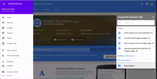
- Improved menu along left allows for ease in contacting support and adding a manager
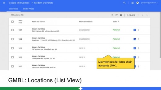
- List view is available to both basic GMB and GMBL whitelisted bulk users for faster navigation
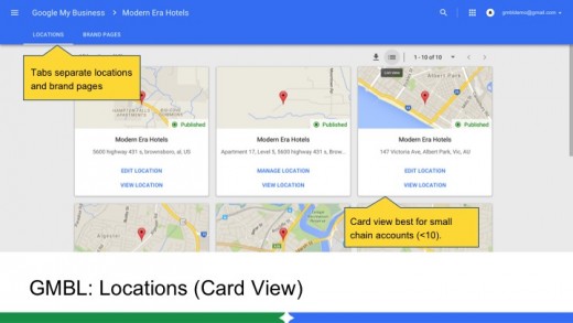
- Better distinction in the menus between Location and Brand Pages
- Quicker access to deeper review & insight information
Here is additional coverage:
Joy Hawkins – Imprezzio Marketing
Linda Buquet – Local Search Forum
Are you seeing the new interface? If so what country are you in?
Here are some screen shots of the new interface.
© Copyright 2024 - MIKE BLUMENTHAL, ALL RIGHT RESERVED.
Comments
12 Comments
The screenshots look good. I don’t see the interface in Canada yet.
I spotted the new ‘Brand Pages’ tab popup at the top of the dashboard, but nothing else has caught my eye so far. (USA based)
Looking forward to this new interface!
I’m taking care only for 1 Google My business page but earlier today I noticed the change in the dashboard view. It looks exactly as the screenshots above. So… it can be seen in Australia. Thanks for the post.
We are not seeing it on any GMB location accounts in Denmark yet.
Not seeing it yet in Nebraska. I can’t contain my excitement to play with it though. And such, have realized, I am an SEO nerd.
I get the new Interface in Germany since couple of hours and i get it signed in with my TC account as well signed in to an ordinary normal User account
My only complaint so far:
The new inteface does’t show you “at a glance” any linkage to GMaps or Google+
It just contains a link “VIEW LOCATION” linking to GoogleSearch only
You can however get those links via two additional steps:
Hit “MANAGE LOCATION” and then top right the red button “EDIT”
Scrolling down to the page bottom you will see all three linkes as used to be on the old dashboard Interface.
I love that they made it easier to find the managers of the page. This always baffled me at how hidden it was before in the settings area.
I’m really happy that Google is making efforts to make the interface more user-friendly.
Now if they could only do something about all the spam…
@Joy
Do they make it easier to now find contact information for existing owners/managers? I would prefer seeing email addresses for each manager rather than their names!
@Florent I can’t imagine that Google would ever divulge the emails for privacy reasons.
@Joy
Oh, I didn’t mean visible to the public, but rather visible to other page managers. This concern may only apply to agencies with access to multiple businesses and large chains with individual location owners. I guess we’ll see what this looks like soon!
I am seeing the new interface here in Sydney Australia, on both the bulk manager and also individual. Here is what I am seeing http://dsupport.d.pr/1865S
Do you have any info on the ability to add locations to GMB? Do I just set up one per location? Or can you declare your locations for 1 listing?
I’m rubbish at this!
Thanks!
Comments for this post are closed.