Understanding Google My Business & Local Search
First Sightings of Stars in the Carousel
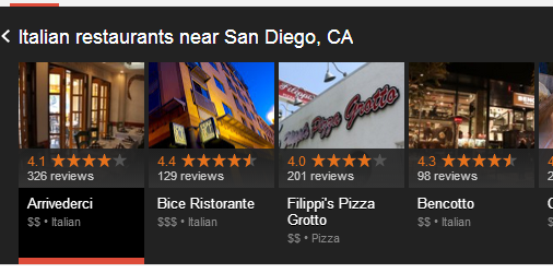
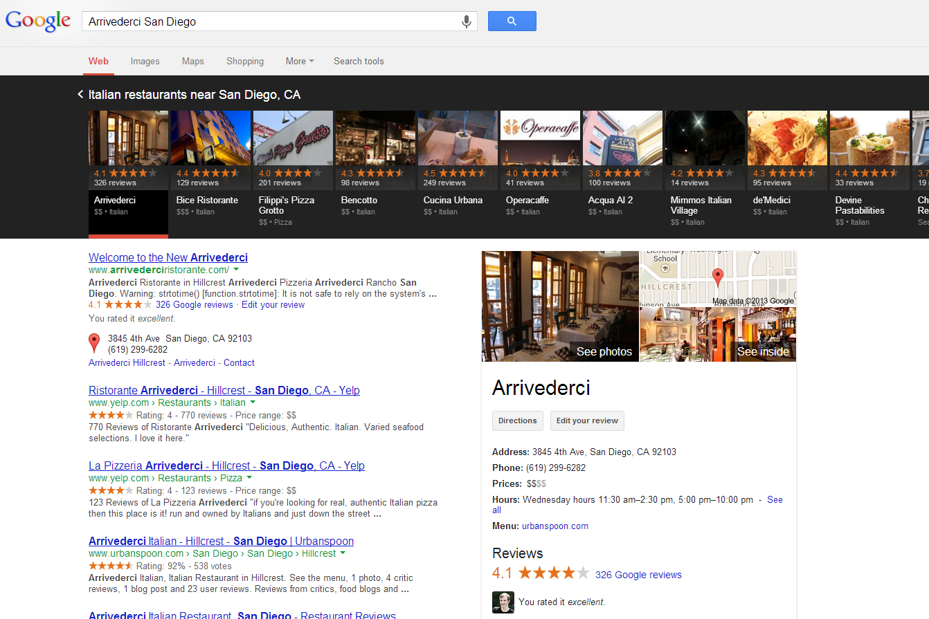
Max Minzer captured the first screen shot of stars in the Carousel. The stars are shown with the stars AND ratio in the same red color but when contrasted with the black background they become very, very, very obvious. The reviews are much more obvious than in the 7-pack reported earlier.
(Click to view larger):
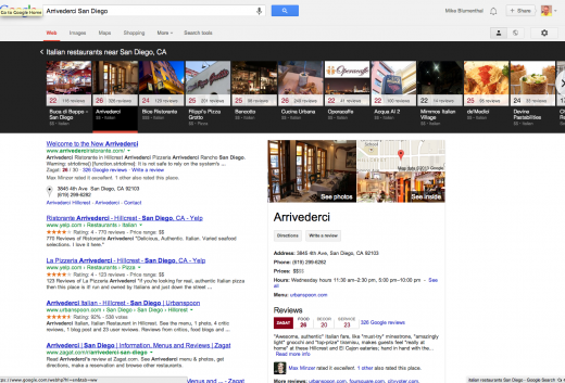
For reference here is the same screen shot that most folks are seeing with the Zagat notation:
(Click to view larger):
© Copyright 2025 - MIKE BLUMENTHAL, ALL RIGHT RESERVED.


Comments
30 Comments
As I said before, great catch, Max. Thanks for posting, Mike.
I wonder whether Google’s click-tests revealed that people just weren’t really engaging with the carousel much. Kind of like those people Mike Ramsey recorded in his post. Obviously, the 30/30 “Zagat” ratings were on the way out anyway, but I’m guessing that low clicks might have been the last nail in the coffin.
Also find it interesting that Google chose to go back to the exact same golden-stars look and didn’t try out a new color. I can’t help but think that Google wanted to neutralize the advantage that Yelp has with those nice rich-snippet stars showing up in the SERPs.
Just speculating out loud here
@Phil
I think we are just seeing the affect of timing on the decision. They announced the return to red stars on May 15th. The Carousel came out before the transition was complete on June 18 so it still had Zagat.
The announcement on the 15th was quite clear that the were ditching Zagat across the board. Here is what Jade said in the forums with the announcement:
The changes will appear to some users today and will continue to roll out on Google Maps for Mobile, Google search results and Google+ Local in upcoming months.
Interesting. I hadn’t considered Google’s timing that thoroughly.
I got a chuckle out of that announcement. Especially the part with “The system maintains the precision of the former 30 point scale while improving the readability and accessibility of the business listings.” What a progressive-sounding way of saying “Yep, we F’d up and are pretty much going right back to what worked fine all along.”
@Phil
Newspeak is what I think that is called.
Try Chrome now.
I tried everything earlier today – no Stars.
Still not seeing stars in FF but just started seeing in Chrome.
Also in the regular pack. Stars, stars everywhere. YAY!
@Mike
Or Washingtonese.
@Linda
The only stars I’ve seen today were when I bonked my head on the kitchen cabinet. And I’m a die-hard Chrome user.
I like the 5-star system much better. It’s simple and works well, in my opinion. The only way to improve would be to color-code the ratings (similar to Yelp). Visually, it makes it easy to quickly scan through. 5-stars = green, 1-star = red, with transitional colors in between.
Any way to sort by rating? I rarely see any way to sort by rating on any platform. Though, on the horrible iOS “Google Local” app (which I don’t think is being supported or developed any further), the user could actually sort by rating. That was the only way I have ever been able to do so.
Boo. Lights are out, my stars are gone.
But more folks at my forum are reporting seeing them, so still just in test mode.
@Troy
I generally agree with you about the 5 Star rating system but the one area where Zagat was an improvement was in the granularity of distinctions in restaurant results. I will often choose someplace that has a 28 on food quality but a 15 on decor as I like funk and good food. But the single rating system doesn’t capture that nuance. My preference would be a 5 star system with 3 inputs for restaurants (only).
@Linda
Remember that for Google stages releases of new products ARE their test.
I wonder what kind of confusion that will breed when the user sees one star rating in the carousel and local listing and then clicks through to the web site where a different local rating is used.
Still, this is interesting and puts even more emphasis on getting reviews in Google+.
@Craig
Google is moving towards a single 5 Star system across their whole platform. The new Maps has changed, the new Maps app for iOS and Android has changed the G+Pages changed last week. The old Maps, web results on the desktop, web results on mobile are all that’s left and one assumes that will change shortly. This appears to me to be the final change. Once these have gone to 5-stars everything at Google will be 5-stars.
@Mike – Yes. I just find that for some sites they have implemented their own local review systems so the review stars you see in the serps won’t line up with the review stars you get when you go to the page if they’ve implemented an in-house review system.
That could cause some disconnect with users.
@Mike 10:54am: Good points, and I’m not knocking the value of being able to rate subcategories, but if you do it for one type of business, I think you have to do it for all–restaurants certainly. But then, what about department stores. They could be rated on value, customer service, and shopping environment. Though subcategories are nice, I think it really opens up a can of worms and causes inconsistencies across multiple platforms. Sometimes simple is better, even if we have to give up something else. Of course, this is an unprofessional opinion.
I’d still like to sort by rating. Wasn’t that possible some time ago?
@Troy
Good question about order by rating. In the earliest tests of the carousel that WAS a feature but it apparently got dropped along the way. Why that was I am not sure.
@Mike 11:43am: I must’ve missed that one. I don’t remember that since the carousel started. Thanks for mentioning it. Maybe it will return. (Fingers crossed.)
Haven’t seen the stars yet..but I saw this incredible Neapolitan pizza place with a relatively measly 22 rating. I think google should ban the peeps that didn’t give that place an incredibly great rating!!!!
To those who have been critical of the black background for the carousel: now that we see how the contrasting color of the stars look in the carousel, does your opinion remain unchanged?
@Kerry “To those who have been critical of the black background for the carousel: now that we see how the contrasting color of the stars look in the carousel, does your opinion remain unchanged?”
To me the orange on black makes me think of Halloween.
As of late Thursday I have yet to see stars. No big deal. If they are being delivered we will see them shortly.
I’m ever more grabbed by the perspective of the carousel on the food and beverage and hotel industry…along with some similar categories.
The disparity and variety of quality of pictures is quite striking. Additionally the ultimate showing of ratings quality and stars will probably influence click through rates.
On a wide pc screen I’m seeing 12 pics. That is a lot of choices. My oh my I think that will crush click through rates for #1 and spread the choices out from among the first 12 on a wide screen and the full amt of pics (I’m seeing up to 18 total).
One other point that grabbed me. I read through some google + pages. I was looking at a restaurant category. You could tell who had claimed the listing and who hadn’t just by seeing who had a description below the rating.
One description entirely grabbed me. It read like a professional review and of course quite positive. Extremely clever, extremely inviting. No other description had anywhere’s the appeal. Very clever!!!!
Ha ha. I’m changing all the descriptions for our smb’s.
@Kerry @Linda
I agree with Linda, on the carousel it’s like I see the star ratings, but they aren’t as prominent as they should be. I would go with a light gray background color on the carousel.
Now I’m seeing the review stars for branded searches. (Only in Chrome – not in FireFox.)
For example:
https://www.google.com/search?q=barbara+oliver+jewelry
Can’t wait for this to come to Australia. Have not seen it yet although got the preview and Google Maps invite
Hi Mike,
We just noticed that our client, a hotel, is not in the carousel but is listed as within https://maps.google.com/maps (old maps) for the term ‘hotels in Boston’.
We are the only hotel skipped over. Why is that? I’ve begun pulling all the G+, on-page factors, link factors, etc. that I can think of to find a reason why we weren’t in the carousel, but this skipping us when the client is listed in the left rail of Maps really has us stumped.
Any ideas what is going on?
Just saw stars for the first time in the carousel. Didn’t see them in the PAC.
The first and only Carousel search I made was for pizza (in my location). Pretty wide screen allowing me to see 12 pictures.
I went to all 19 places with stars. They had rankings from 3.8 to 4.4. From my perspective as I looked at the stars on each pic…it all looked the same.
sort of a dark background. I’ll have to give these a lot more looks. I wonder what is going to grab searchers’ attention. One thing that is clear to me is that with up to 19 or 20 pics at the top…their is far more opportunity to pick from among choices.
I suspect this presentation will kill traffic to that business which used to sit at the top of the pac…and spread it around.
Now seeing stars in both the PAC and on the carousel in our area.
I’m seeing stars in all 3 browsers now. Chrome, FF and IE. (I’m in Socal.)
In the SERPS and the carousel. Stars EVERYWHERE!
Others are reporting too. So I think this may be starting to roll out or at least they are testing on a much wider basis.
Thanks for the update Mike! I’m seeing the stars everywhere – the carousel, search, G+ using chrome. My location is east coast – MA.
What I really like on the carousel is that you can easily identify who might have not claimed or optimized their Google+ Local page because their is no photo or photos. I believe you pointed this out in the Local Search Experts webinar.
We are glad the stars are back. The everyday user likes to see star ratings, not a system where they have to think “what does that mean”.
@Susan
Yes that is true UNLESS google has scraped some photos someplace or there has been a community edit/upload.
Good to know Mike – thanks!
@ Lauren
Without a lot of research, my first guess would be that it is a blended result NOT a pure map result and your website is not strong enough.
Comments for this post are closed.