Understanding Google My Business & Local Search
Preparing Images for the (Coming?) Google Mobile Local Carousel
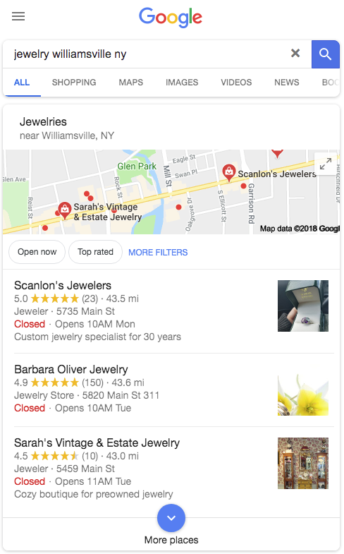
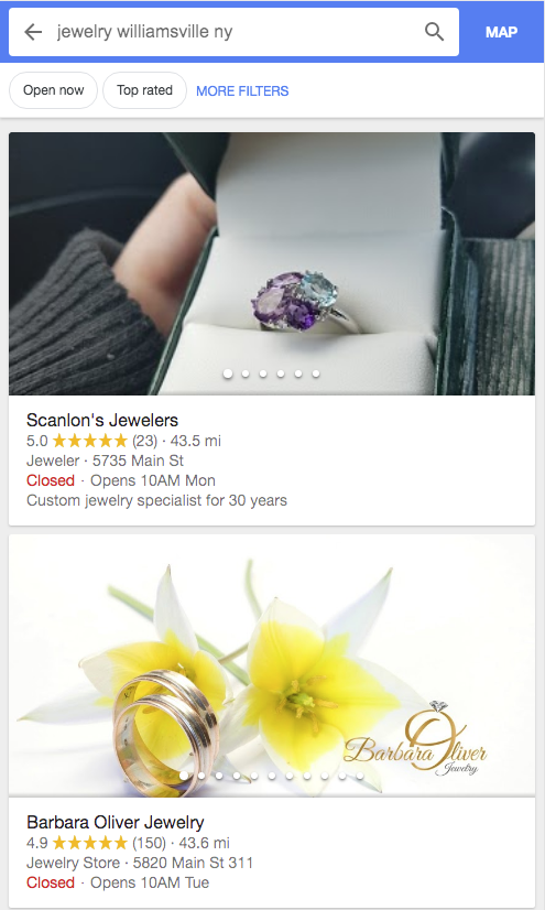
 Last week, off and on, we started seeing the use of the image carousel in the mobile Local Finder. This is a format that has long been present in the restaurant search results. The carousels have been seen off and on since then, showing up and then disappearing, only to show once again. When they did show they were not in all categories.
For example we saw them in most product driven categories like jewelry, cars and sporting goods but not in professional categories like lawyers and doctors. We saw them in some services like plumbers and HVAC, Dog Grooming and Insect Control (Really? Yes really.) but not in Locksmith or Electricians or Salons. Clearly a test at a grand scale.
Will they become the new normal? As I have said before “Who the f knows?” but it seems likely to me that their use will expand. I am seeing them today on some devices but not all.
 |
 |
Of course this made me curious about the aspect ratios and whether a vertical or horizontal image might be better for optimizing the outcome. Google has never made image management easy and this new display is no exception.

In this case it doesn’t seem to matter whether you are using a vertical or horizontal image as long as the shot is in close AND the main content of the image is center weighted.
The carousel crops to a roughly 480 pixel wide by 240 pixel high view, a 2 to 1 aspect ratio. It will cut that from either vertical or horizontal images.
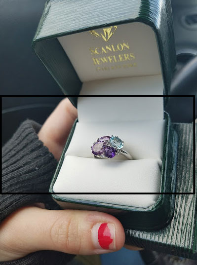
Both of these images worked reasonably well but the difficulties start coming in when you also want to optimize the image for the 3 pack on mobile, the Branded Mobile Knowledge Panel and all the many variations imposed by the desktop and Maps results.
The mobile pack results seems to be one area where you should focus. If the image looks good there AND in the carousel, it is reasonable to take your chances elsewhere.
In this image I have overlain the original image with the crop for both the carousel (solid black line) AND the mobile 3 pack (dotted) so you can get a sense of what I mean by “center weighted”.
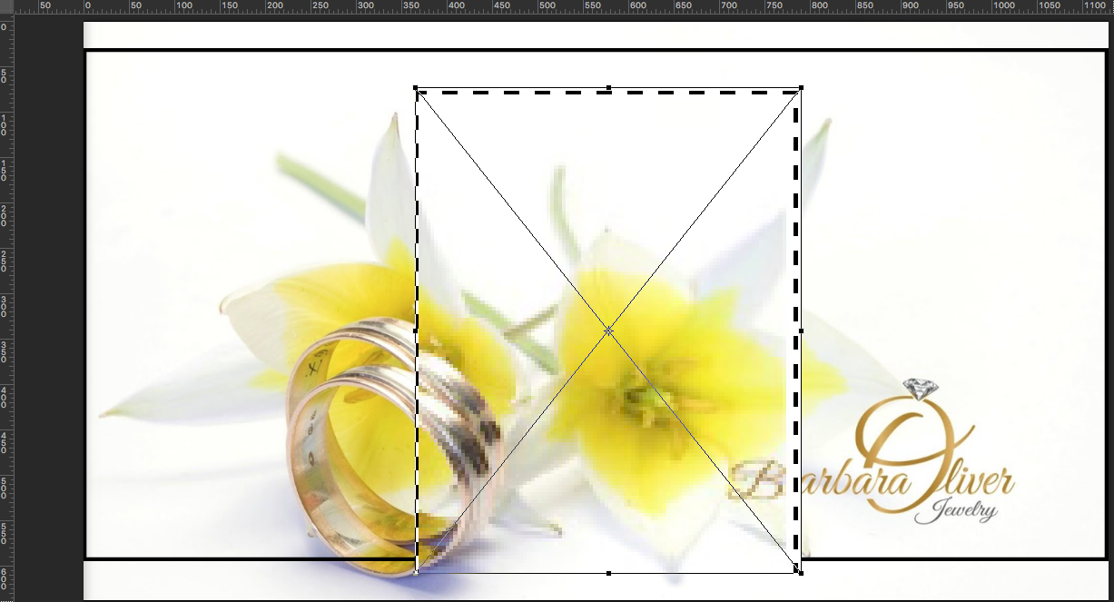
It becomes an almost impossible task for an image to look perfect in every image environment that Google presents. You will see a totally different crop that shows for the Brand Knowledge panel in a mobile browser.
Adding text to the image makes the problem more obvious and a solution more difficult. That being said in many contexts, the text is a differntiator.
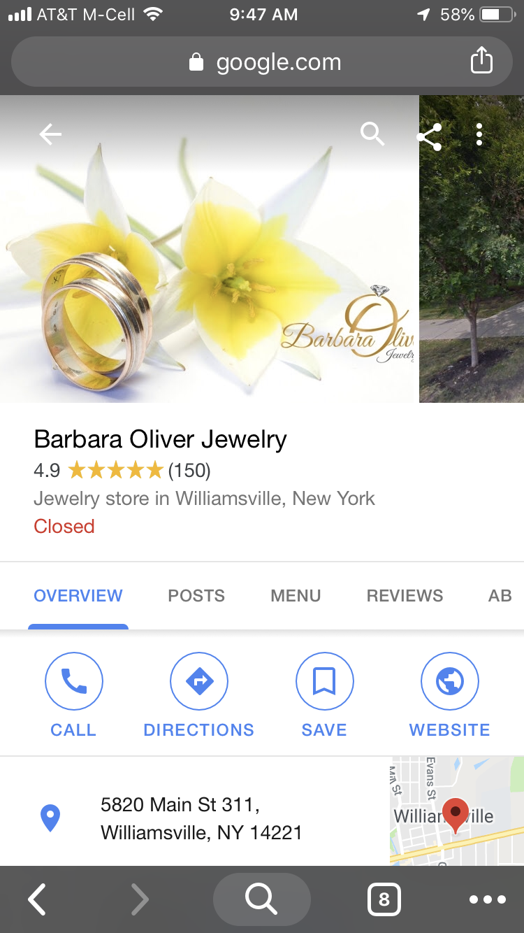
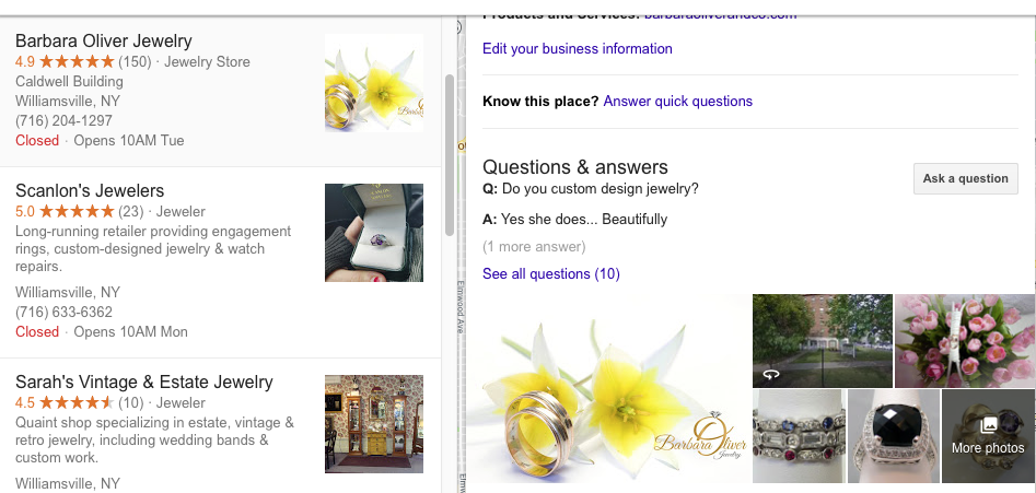
And on the desktop you can see a totally different crop the shows in the local finder.
Last but not least is the fact that Google seems to be experimenting with images and swapping out the cover photo and occasionally showing a different image. It seems to me that this image is perhaps more contextually relevant to the query but it could just as well be a usability test or a machine learning training exercise. 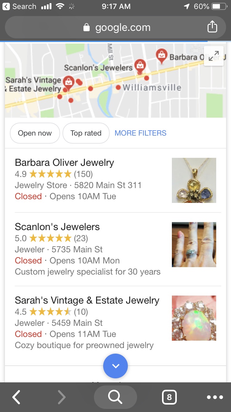
I would be curious to hear of your examples of the types of images Google is showing when swapping out and whether they seem to be query related.
© Copyright 2025 - MIKE BLUMENTHAL, ALL RIGHT RESERVED.
Comments
2 Comments
Great insights, Mike!
@Sherry
Thanks!
Comments for this post are closed.