Understanding Google My Business & Local Search
Some Thoughts On the New Pak Results from Google
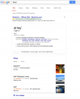
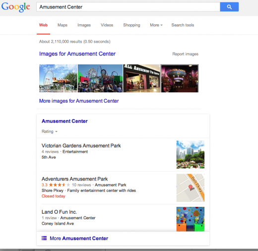
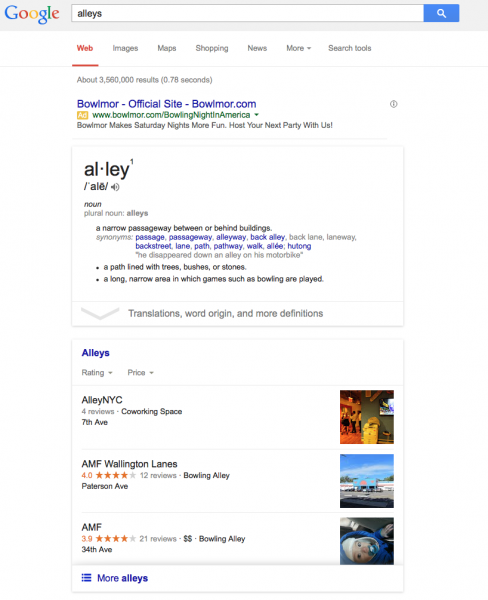
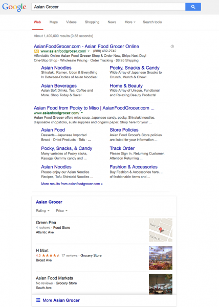
Some thoughts & observations on the new [Hamburger] Pak from Google which for now, like the Carousel, is US only.
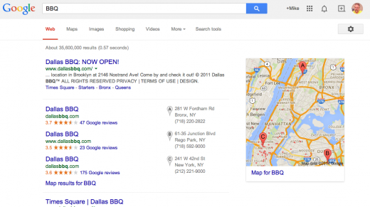
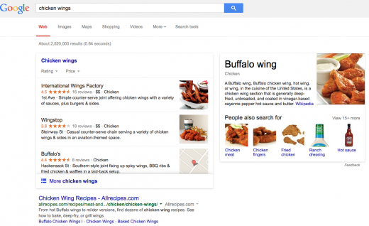
1-The local carousel is still in use and shows when you select a result delivered by “People also search for” in a 7-pack result. Will we soon see its demise as well? Currently Google shows five competitors, not three, below the brand Knowledge Graph. Not sure how that would work with the new [Hamburger] Pak.
2-Obviously that question raises the related question of whether the traditional 3/7 Pack is on the future chopping block as well. The new Pak targets the same leisure and entertainment activities as the carousel; music, hotels, restaurants etc. These “do and see” experiences are both more popular in local search and likely to be more profitable to Google than the results returned with “traditional” Pack results. The Local carousel, introduced in June, 2013, had a time to death of little more than 16 months. And since its inception there has been the general belief that the traditional pack would be replaced. I guess it will, someday. Or not.
3-The new Pak is consistent with both Google’s material design language and mobile first approach. The design even lifts the hamburger menu icon from the mobile design arena.
4-Like the carousel before it, there is no phone #, address or map associated with the display of the listing in the [Hamburger] Pak. To see those things it is necessary to click through to the Knowledge Panel. And if you want to see the details of another listing it is necessary to go back out and then in again. This is one of the worst local users experiences that Google has rolled out to the desktop in a long time. It really should not be that difficult to ferret out a phone number or see comprehensive information for a list of results.
5-This contrasts to the mobile experience. Once you choose Map view on a phone, and view any given equivalent of the Knowledge Panel display, you can swipe forward and backward to easily move through the full details of any single listing. It still makes the phone number too many steps away. What is mobile all about if not clicking to call?
6-One of the biggest changes from my POV is the loss of diversity in the display. The carousel, even though it was ranked, showed no obvious rank in its horizontal display and essentially made position 5 as valuable & visible as position 1. It was relatively easy to scroll to see spots 10-20. This display picks 3 winners and makes those in position 4-10 significantly less visible.
7-In about 3-4% of keyword searches where one would predict that the new [Hamburger] Pak would show, Google showed a branded One or three Pack instead. Obviously the brand predilection of Hummingbird and Pigeon is still in play and is no way affected by this.
8-On “average” screen sizes on the desktop, there is little else that can be seen besides ads and the new Pak. Thus in many search results that return a new Pak, only 3 listings are returned. If there are two ads at the top then only 2 results are visible above the fold.
9-I would love to hear what happens to web traffic for the directory type sites that seemed to be doing well when shown below the Carousel. Clearly this was prime space for TripAdvisor, Yelp etc and this can not have been good for their traffic. In unpublished user research that I did, a number of users would flat out ignore the carousel and move right to a branded website like TA or Yelp. I doubt that behavior persists with this display.
10-Interestingly even though the new [Hamburger] Pak almost always returns at the first position after the ads, it doesn’t always do so. In the searches done so far that trigger the new Pak, it shows at position two, following either images, an answer box or a web result with site links about 4% of the time with no geo modified queries (2% of overall queries). The non geo modified queries are obviously more ambiguous than the geo-modified ones and it makes sense that Google might slot something above the Pak. .While is hard and rare, it does seem possible to “dislodge” the new Pak. Images, answer boxes, really strong web site and, of course, branded results all do so.
© Copyright 2025 - MIKE BLUMENTHAL, ALL RIGHT RESERVED.
Comments
11 Comments
Mike: I’m glad to see that you spoke to the horrible user experience: No phone number, address, no link, no map.
I know the engineers at Google are brilliant. They must know something the rest of us don’t know. They have somehow figured out that searchers looking for restaurants:
Don’t want to know the phone #
Don’t want to know the address
Don’t want to know the restaurant’s location on a map
Don’t want to have a link to the restaurant site.
The google engineers probably have determined that consumers don’t want to know the prices of meals, or the hours of operations or possibly what the restaurant serves…or other trivial little details.

By the Way, this is NOT the default in Europe. I just pulled up a view of restaurants in Edinburgh using google.uk.co A 7 pac with links, a map, phone #’s and addresses; If I pull the link to more restaurants and switch to list view I see a LOT of helpful info and I can see it on A LOT of restaurants. If I click on one of them it pulls down a knowledge panel with the link to the restaurant….but the long list is still there.
That is HELPFUL information. Unlike what currently exists in the US. I could add comments about the European market contesting Google’s monopoly situation….but I’ll pass:
In the US on the restaurant side I do a lot of restaurant searches in the area where I live and in other markets. There are few ads. Its different than the hotel and travel industry’s with regard to google advertising.
I guess google got tired of the restaurants NOT paying them for adwords or not getting a piece of the reservation market. The big “knowledge boxes” and the lack of available contact or link information are not exactly a subtle sign to restaurateurs; If you want google visibility–> PAY UP.
That is a bit like Yelp, IMHO. ;). Its just slightly more subtle.
After all is said and done we finally learned all there is to know about knowledge boxes, knowledge panels, etc. They are great ways to starve websites of traffic.
As a consumer I’m now using bing or yelp to find local restaurants. The information is better.
Dave while I absolutely agree that not showing phone etc is a bad user experience particularly on mobile, it has been that way since the carousel was introduced in 2013.
Mike: It was easier to access with the carousel; not as stunningly absent nor was it being Thrust in front of the user at very first glance.
I think the presentation on restaurant info for a user in the US and Europe is remarkably different. People may say it has a lot to do with “rollouts”. Its hard for me to buy it in light of how bad this presentation is.
On a separate issue, over the long haul, I’ve been stunned by how relatively thin adwords restaurant advertising appears (IMHO relative to some other verticals) I can’t help but think the large Knowledge Box/Knowledge Panel etc. is going to starve restaurants of google search traffic. On the other hand it irks me to see a knowledge panel with bad information, and/or info that is difficult to get corrected….when the correct info is often on a website. Now w/ the knowledge panel above the website and pushing down access to the website, it will magnify the issues with bad knowledge panel info.
….and finally, per your comments above…as to this being some of the worst user presentation in years. Yes I agree. The difference was that years ago, Google was struggling with endless data, back end, and presentation issues galore. Those took years to work through.
This appears more deliberate. Don’t you think??
Great post Mike, I was wondering what your thoughts were on this helping sites like yelp by Google not providing information. Is Google trying not to publish information on the search to help companies click through? Just a thought.
@Justin
The issue for Yelp and TripAdvisor is that they are now generally pushed below the fold. I do not know how users will respond to that need. It could, though be bad for them if users don’t scroll below the fold. I am curious to know myself.
Personally I am glad to see that Yelp is getting pushed down, as I have no respect for their business. Anything that reduces traffic to Yelp is a positive in my book.
I am not too distrubed by the need for a single click to get more detailed information on a restuarant just yet. We may even see Google refine these pack results in time. I do find it odd that we get a street name without the address in the results. It’s not that hard to include the numbers. Seems half-assed.
I am liking the filters and this certainly seems to reward the businesses that have taken command of their online marketing. Reviews, menus, completed descriptions = win!
@Micael Doran
I don’t particularly like yelp either but google clearly has a plan to extract more and more $ from their search/ad engine.
They have become a utility in our society and it is arguable that our society would be better served if they were more heavily regulated or perhaps nationalized.
Google is obviously intent on both maintaining their market position and opting to replace search results with income opportunities.
As gateway to our world have we ceded too much control to a non benign entity?
Mike – is there any way to sort through the results in the hamburger pack without clicking on more at the bottom of the pack? On mobile it’s easy because you can just slide to view more listings, but I don’t see anyway way to do that on desktop without a click.
Morry that’s one of the problems of google porting this design to the desktop and why I noted it was such a bad experience.
Well, pushing down the likes of Yelp and TA must have been a huge priority for Google; now accomplished. However the result is not going to play out well for users, so I would expect more changes.
Hello from Europe,
The new “Hamburger” Pak is now displayed when searching in Google.co.uk and other ccTLDs. My thoughts are the same, I can also add:
1.Don’t want to know the phone #
2. Don’t want to know the address
3.Don’t want to know the restaurant’s location on a map
4. Don’t want to have a link to the restaurant/hotel site.
5. Last but not least – Don’t want to send any traffic to Google+! How are we going to show users and potential clients our post and offers if there is no direct link to Google+?
Very bad user experience on both desktop and mobile – hope this new look doesn’t stay for long.
Comments for this post are closed.