Understanding Google My Business & Local Search
Google Testing Carousel Replacement
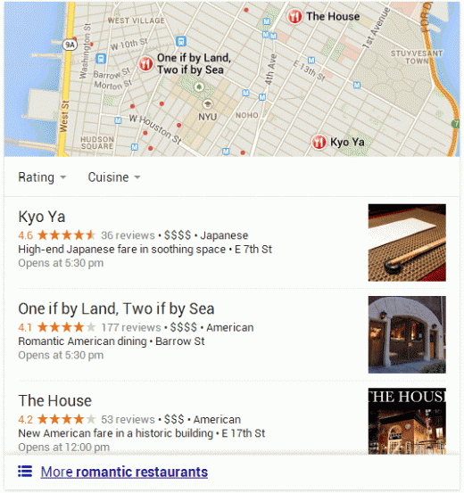
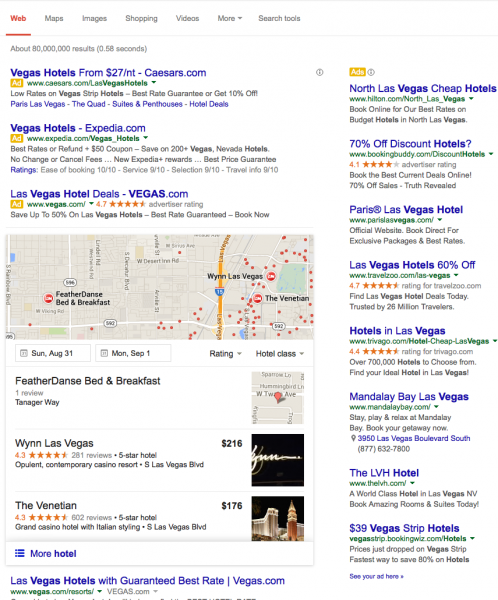
Last week, Dr. Pete Meyers of Moz, posted on Twitter that he had seen a new deskop pack result that seemed to be replacing the Carousel. He has emailed me to note that he is now seeing it on a number of broad queries “including “chicago restaurants”, “restaurant reviews”, “chinese menu”, and “vegas hotels””.
James Gibbons also reported a search result where the carousel had been replaced with a 7-pack,
As Pete noted in his email most of the new results that he was seeing were in place of the carousel AND the result mirrors exactly what is currently shown in mobile.The mobile change over occurred last April.
Will Google change away from the carousel? I am not a betting man and Google does do a lot of testing but my gut says that they just might move towards this new display. They have been on a toot to “clean up” the visuals on the main search result page (fewer packs, no author photos, fewer video and review snippets) and this change fits that mold.
Have you seen this result? What browser were you using? What phrases?
Update: I am now seeing this result using Firefox on my Mac searching for “vegas hotel“:
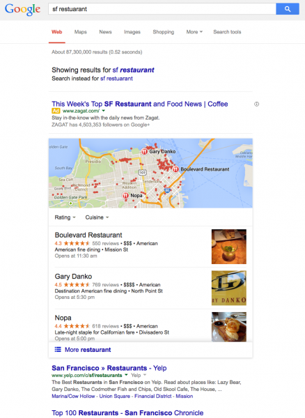
See other searches:
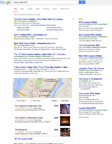
This search for luxury hotel NYC is particularly telling with the amount of revenue generation above the fold:
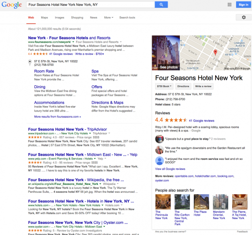
What is totally fascinating is that when you click on the new style pack result, you are taken to a brand search. THERE IS NO OPTION to visit the website, view reviews or even get to the Plus page until you have clicked through to the brand search. I.E. when I clicked on Four Seasons in the screen above, the only place you can get to is this screen:
When you click through the Map at the top of the results you essentially see 3 results. However if there is ad that is shown at the top of the results and counts for one of them. Thus you only see 2 “organic” listings before scrolling.
Updated 5:20
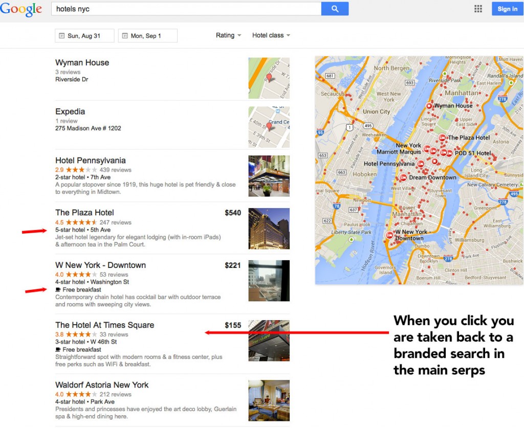
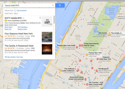
Another interesting difference occurs when clicking through on the More link below the pack. You are taken to a display that looks like a Maps list view but that
1- has new features added to the listings like the star rating and a breakfast icon
2- take you back to the branded search on the main search page when clicked
It is apparently a new sort of organic display – here is the URL https://www.google.com/search?q=ft.+lauderdale+movers&ie=utf-8&oe=utf-8&aq=t&rls=org.mozilla:en-US:official&client=firefox-a&channel=fflb#channel=fflb&q=hotels+nyc&rflfq=1&rls=org.mozilla:en-US:official&tbm=lcl so maybe someone could parse that and see what does what.
© Copyright 2026 - MIKE BLUMENTHAL, ALL RIGHT RESERVED.


Comments
7 Comments
Andrew just shared a screenshot he spotted for movers too. So not just food and lodging.
“ft. lauderdale movers”
http://www.localseoguide.com/google-local-desktop-serps-continue-to-get-more-mobile/
But I can’t replicate, so they are still testing and just depends what datacenter you are sitting on.
@Linda- that’s interesting.
What’s notable, if this replaces the 7 pack for ALL local searches is that there is no link to website and no address -just street. And no phone.
Mike since you are seeing it (I’m not) where do you click to get more info and where does that click lead to? A branded SERPs page kind of like when you click a result in the Carousel now?
@Linda
I added that. No ability to click to website, reviews or even the Plus page. Brand search is all she wrote!
Thanks for sharing Mike! I’m still not seeing this in my SERPs, but this is very Interesting and something I’ll keep an eye out for. It makes sense from a business standpoint for Google to standardize desktop and mobile search results (less work on their end).
@austin
and it makes sense from a business standpoint to be sure that ads are visible on the top of the screen and that there is as little visual distraction as possible.
I tried your link from the 5:20 update here in the Netherlands with FireFox & Internet Explorer. It doesn’t work here. It says it can’t complete the search request with the used search criteria and it provides a link to reset the search criteria. If I do that, it changes the url to use the google.nl domain (in FF, not in IE) and changes some of the parameters. Then I see the old style carousel.
Comments for this post are closed.