Understanding Google My Business & Local Search
New Look for Google Local Search Results
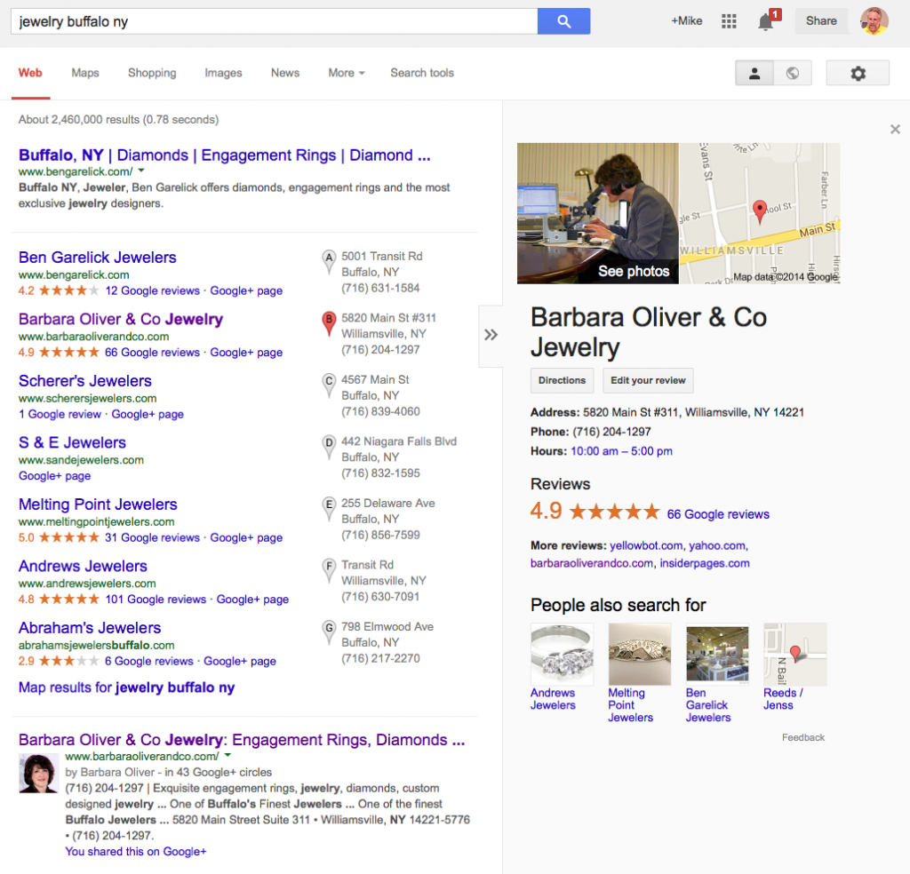
Google is apparently testing a new, cleaner front page layout that will affect both local and regular search results. First reported by Dan Barker on March 5th, Searchnewz is reporting that they will be rolled out. I am now seeing this new layout on Safari for Mac.
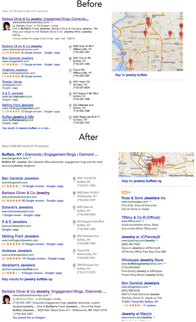
The differences:
- The removal of the underlines from all the links that appear in the search results on both paid and organic content.
- A new font style and larger font size for the titles. This results in only 55 characters visible in the title tag; the same as mobile.
- When a listing is rolled over and the KG Info Panel is show, the whole area to the right is greyed.
- Ads are now annotated rather than shaded making them more obviously ads to a color blind person and on LCD screens compared to before.
Here are some comparisons of the change before and after (click to view larger):
Note that the grey extends down the full screen when the Info Panel is selected for Barbara Oliver & Co Jewelry:

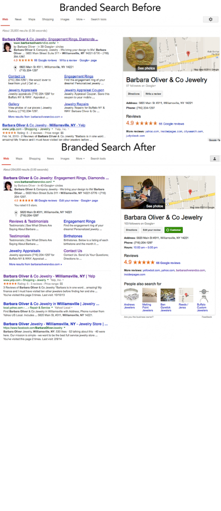
Branded search comparison:
Are others seeing this?
© Copyright 2025 - MIKE BLUMENTHAL, ALL RIGHT RESERVED.


Comments
22 Comments
Good scooping, Mike.
Noticed the gray NAP info a couple days ago. The no-underline links have been on and off for some days. Using Chrome for PC.
@Phil
Thanks for letting me know that they are on other browser. Dr Pete just noted: Seems like the new design is entering an aggressive test phase – seeing it a lot more.
I had seen the ad change about 2-3 weeks ago but they didn’t stick.
I am currently seeing on Safari & Chrome but NOT Firefox on my Mac.
From the first “before-and-after” snapshot, curious as to why there seems to be such a drop in search results 22,700,000 vs 2,460,000. Also, why is the Google Places for Barbara Oliver & Co Jewely in second place when she clearly has more reviews and a better score?
Hi Mike,
Was reported at my forum 6 days ago and we’ve been discussing there: New Look to Google SERPS?
I’ll add a link from that discussion back over here.
I wonder how long before we see tests where there are no URLs (currently in green lettering) in the 7-pack. Compared to everything else on the page, they’re pretty extraneous. Removing them would free up space for another ad under the search bar.
yeah….same up here in g.ca too, Mike….the new larger font yes has cut the displayed # of chars too…but we also see up to 60 – depending on the proportional font char widths….
damn! now I gotta go and retest every single client lengths….
I actually caught a snippet of the new design a few days ago and created an in-depth comparison between the old and new design: Google new search results page
Seemed like to me that the “shaded” ads area was getting lighter in the last few months – I like the bolder ads icon in the desktop SERPs — aligns more with the mobile SERPs.
Mike, thank you for reporting this!
Your first “before/after” screenshots threw some of us off. Immediate changes that caught my eye were ads and a squished map. I now realize that search query in “before” screenshot (jewelry buffalo) is different from search query in “after” screenshot (jewelry buffalo ny). The actual “after” for “jewelry buffalo” is not much different (http://goo.gl/9WcScM) – only style-wise, as you noted.
That’s what initially threw me off when I thought it was a radical change with search results and its “elements.”
P.S.
I see this new layout for all my searches – both organic and local results.
Hey Mike,
Thanks for sharing the before and after shots with us, I didn’t think there was much difference in the changes! I feel a bit half hearted with this update, I like how google have added the follow button in the knowledge box for a brand search but I’m not entirely keen on the amount of ads google have placed under the map for a local search. Any idea if this update is just a beta or is it to stay?
I’ve notice these changes a few months ago, on Chrome & Safari as well.
Mike – I see all of the changes on (Mac) Chrome, FF and Safari.
@Jim Rudnick – Screaming Frog works great for assessing multiple title tags length quickly
… oh and I like all of the these mods, cleaner and easier to see what’s what.
Odd that there is so much un-used ‘gray area’ space below the business info on the right side of the page
Looks like the change was good for bengarelick.com
@Bill
Garelick had been running number two and Oliver three but it appears that the number one has been penguined. About time.
Mike – Thanks for sharing before/after shots to help visualize the changes. Confirmed changes are visible on Chrome. I’m rather surprised that more information from the places page is not published in the gray area. Entries with no reviews appear rather empty.
Really BAD!
@Mike I’m in Tampa and using both Firefox and Safari I am seeing the new style of layout here. Also seeing a wider spread use of the carousel with “Users also searched for” listings as well.
Read some article today that its different for everyone, based on locality, device, OS, and Browser additionally depends also on user profile and privacy settings.
I do marketing for a local business that is in the remodeling industry in Chicago and I’ve run tests with various machines, os, browser and users profiles (I borrowed my sisters gmail), CONFIRMED it is different. Also noticed 2 same searches will provide different results.
Our game just got harder….when it was not easy in the first place.
Sorry for posting an additional comment but here is the article I read in order to run my tests – Paragraph 4
http://contentmarketinginstitute.com/2014/03/owned-paid-earned-content-strategy-seo/
Dear HP
It has been this way for a very, very long time. There is no, one search result. But the basics don’t change.
The second one looked cleaner in my opinion. I also agree that the shaded area is now looking more integrated with the real results. I guess their goal is to drive more traffic to the ads by making them look less like ads.
Comments for this post are closed.