Understanding Google My Business & Local Search
How Many Results Are Required for the New Local Carousel to Display? At least 5
It would appear that the new Local Carousel will show up to 20 listings if there that many in any given market. But how few will it show? It seems that the answer is five listings. And at five they look weird on the screen. If there are fewer than five available to display then the results retain a traditional 1, 2, 3 or 4 pack display.
To determine the limit as to when the carousel would show I queried on the non category search “pool hall + geo” in a range of city sizes across NY State. I made the following searches (plus a few more) to find results displaying each number of results up to 5 and beyond. I was unable to find a search for pool hall that resulted in a 20 listing Carousel.
| pool hall Corning NY – 1 Pack | pool hall Jamestown NY – 2 Pack |
| pool hall Avon NY – 3 Pack | pool hall Fredonia – 3 Pack |
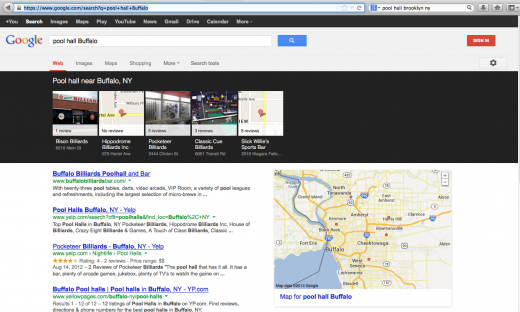
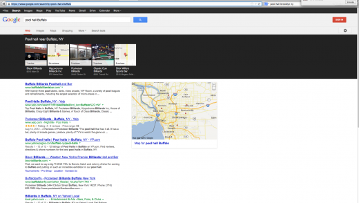
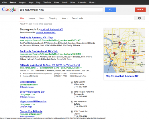
| pool hall Amherst NY – 4 Pack | pool hall Buffalo – 5 Listing Carousel |
| pool hall Arcade NY – 5 Listing Carousel | pool hall Geneva NY – 6 Listing Carousel |
| pool hall Medina NY – 9 Listing Carousel | pool hall Albany NY – 9 Listing Carousel |
| pool hall NY NY – 18 Listing Carousel | pool hall Brooklyn NY – 18 listing Carousel |
Depending on the screen resolution less or more black will display when only 5 or 6 results are showing. The first image is on a 1330 x 1000 display (typical of the average user – 46% of users have this size or smaller screens) and the second is the 1920 x 1200 pixels(7% of screens) display of my 24″ iMac. Both have a disconcerting amount of black in the displays and are both visually very distracting. Where is Steve Jobs when we need him….oh wrong company.


© Copyright 2026 - MIKE BLUMENTHAL, ALL RIGHT RESERVED.


Comments
11 Comments
Certainly good information to know!
I’m still puzzled as to why Google chose pitch-black for the carousel background.
Maybe it’s just that Marissa Meyer’s design sensibilities are no longer at work.
But on top of finding the whole carousel UX not very good to begin with, I think the black background is jarring, and draws too much attention to itself when the carousel isn’t full of nice photos. It looks like a buzzard in a marshmallow factory.
@Mark
Thanks
@Phil
Great simile!
woah! Not a huge fan to be honest. Sort of takes away the rankability of your listing and just chucks everyone together. Which probably isn’t such a bad thing seeings as I see people outrank me who don’t do anything at all and have inaccurate information. But still…black…WTH were they thinking.
Maybe Google did it in the hopes of removing any advantage that might have been found by attempts to game the system. Looks like choosing a really awesome photograph is going to matter a great deal.
Personally I find the design obtrusive, distracting and in complete violation of Google’s design principles. I know they want people to notice the new carosel but this is even distracting from the Adwords compents of the SERPs page.
This is similar to the last major refresh on Google analytics except with analytics they went back to the drawing board (weeks later) to improve the dismal user experience and awful functionality.
@Sean using the words Google and design principles in the same sentence a year ago would in and of itself been blasphemous. 🙂 But I agree particularly in an under populated carousel it is very distracting.
@Jay
It doesn’t chuck everything together… just the top 10 or 15 ranked businesses. In that sense it “flattens” the search results. It is still unclear if being left most (ie #1) generates more click throughs or not.
As @Carmen noted it is increasingly important to have a great photo.
Mike, this is not the case when searching for “italian food + geo” for small cities. All are showing 20 images. They’re pulling listings from other cities in the surrounding area. But since you can’t see the address immediately users won’t realize that the listings are NOT in town they were searching for. Users may quickly become disenfranchised with clicking on Carousel images.
So this won’t work for the long term. I’d say Google has a choice to either stay with the blank black program or replace the “$$ Italian” with the city, ST below the photo.
@Jeffrey
Google defines the radius differently for each search. The fact that they are showing 20 means that they have defined the radius for that search to include a broader area.
I can understand the critics regarding the choice of the blalk color, but we must admit that it “does the job” : it draws attention.
The user looks at these pictures and that’s what we want from a local business point of view. I guess, from a directory point of view, or from an OTA point of view, this is just a nightmare.
Comments for this post are closed.