Understanding Google My Business & Local Search
Google Places and Maps Takes on a New Look
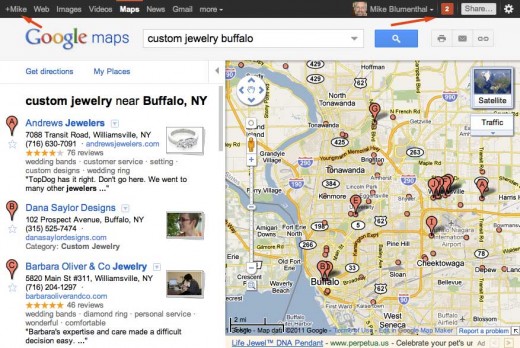
Yesterday afternoon Google, in anticipation of their coming Google+ social product, rolled out a new interface across most if not all of their products including Google Maps, Google Places, the Place Pages AND the mobile interface. The change, first spotted last weekend, adds a sharp, modern and one might even say a designed look to the UI. While the UI is a significant change, it is but a prelude and perhaps foundational change to Google’s forthcoming effort to “socialize” all of their products with the new Google+.
You will notice in my screen shot, the integration of Google+ along with the many other changes to the interface:
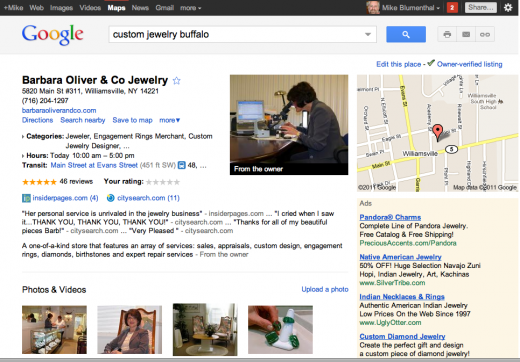
The Places page has a similar look but the outcome, because of the start contrasts and additional whitespace is more striking. Although it does seem that there might be more ads than previously. They are certainly more noticeable:
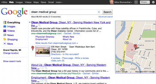
The new One Box display, rolled out last week, makes more visual sense when viewed in the context of the new interface as well:

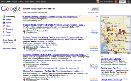
Here is a screen shot of the blended results in the new layout. Like the One Box, the recent changes were obviously made with this UI update in mind. Although even here, with the pins and the Map, the users eye is still drawn away from the search results towards the array of Google products, the new (bright red) social function and the user photo at the top of the screen:
© Copyright 2025 - MIKE BLUMENTHAL, ALL RIGHT RESERVED.


Comments
21 Comments
Mike: From the perspective of the smb, by far the biggest impact to occur IMHO will be with Google+ connected to PPC/Adwords accounts. I suppose a blessing and a curse!!
I run a variety of campaigns for various businesses. Their status with regard to profitability, smoothness of operations, strength on the web, etc, varies. My goals are to dominate with regard to organic/Places and PPC. Regardless, I hate spending PPC money….especially when the sites/businesses dominate with regard to organic/Places.
IMO and experience Google+ on PPC ads is an inappropriate application….the only value being to potentially dramatically boost PPC costs.
When I look at my PPC campaigns, and tie them in with conversions….by far the traffic are new visitors. Their choice of the PPC ad is as much a function of Google Placement at the top of the UI page as anything. There is nothing connected to a “deep like” based on experience/etc.
Nevertheless, from an overall business perspective, I unhappily report that it works. We get the leads/we work on selling the prospects….we are able to convert/sell some of them.
Its immeasurably better than not getting the leads at all.
Once again all of us are at Google’s market domination mercy.
@Earl
Don’t confuse Google+1 with Google+… although it is clear to me why one would be confused.
The new UI makes me wanna die.
@Plamen
Too distracting?
It appears to me so integrally tied into their coming social efforts that they can’t back down from it.
@Mike
I agree with your take on the social efforts. We have been waiting a long while to see their social strategy come into view.
Waiting anxiously!
Mike: You are correct. I was referring to Google +1 with regards to PPC.
All other comments remain the same. Google +1 tied in with PPC…..ugh….I don’t like it…..but OTOH…..for some of the accounts….I think its going to help.
Thanks Mike.
I’m not seeing the “link” icon within the new Places listings. I saw it last night (the same way it appears in your screenshot above of Barbara Oliver & Co) but today, I only see the Print and Send icons. Am I the only one not seeing it? Did GOOG move it someplace else?
Matt
Try clearing your cache… its still there for me
I don’t really know why but the new UI looks too white for me (except the top menu) and have too many empty spaces (maybe this is an illusion). The pictures in the listings don’t have frames and if they are white they will merge with the background.
I think Plamen has a point – rather than feeling minimalist, it gives more of a generic feel. The topbar plus search form area also seems like it unnecessarily takes up too much space at the top of the page — and, with maps, you want as much map area as possible.
I was out most of day yesterday. Then late last night when I checked the news there were SO many posts about SO many G changes – it made my head spin!
You know what my next thought was? “FUGGETABOUDIT! I’ll just wait til Mike blogs and boils it all down for me!”
Thanks Mike, anxious to dig in today to check it out in more detail!
@Plamen and Chris
If I may use a bad pun, the high visibility of the toolbar, is by design… if they can get the toolbar accepted then the transition to Google+ will be much, much easier.
My bet is that while it is disconcerting and there will yeas and nays in the press, the change will not affect search behaviors….
With G+ the distraction of the top bar is even more evident… the photo, the red, a big share button… I believe that it is a conscious effort to focus our attention away from search up to the right corner of the screen..
If they then success in sliding G+ in there then the game will truly be afoot as they will be incredibly well positioned for the coming gold rush/struggle for google that local will become…
@Linda Oh well… this is just like vacation and more fun.
Thanks for the vote of confidence! Struggling to keep up with the news between Getlisted Local U in Grand Rapids and a vacation that is supposed to start uh… now.
I bet David Mihm a beer that G+ will succeed
I just think there is TOO MUCH for the average consumer to utilize or understand. Too many pieces of the puzzle that all sort of connect but may be too disjointed to use.
So all of a sudden we have Google+ AND +1 AND Sparks AND circles AND hangouts AND Huddles AND instant uploads ON TOP OF the new G profiles PLUS check-ins PLUS hotpot type stuff (that’s kinda sorta separate but kinda sorta rolled into Places) AND we have Places AND Places posts and the whole complicated messy review piece. (I think there are even other ‘pieces” of new-Google I forgot to mention)
I mean if it’s a lot for people like US to digest, how are they going to get adoption by all the Jane and Joe surfers of the world?
I like the social concept in general and hope it takes off. I just think it’s way too complicated. It’s like they took a bunch of different division’s best ideas and threw them all out there to see what would stick.
I pretty much agree with The Milwaukee SEO post I just added to Scoop.it http://bit.ly/jGtBxk
He wrote: “Throwing Crap Against the Wall… I think even hack, unseasoned marketers know that’s probably not the best way to introduce products to market place or the public. It’s the, forgive the language here, “Shit Stick” method. You throw as much shit at the wall as you can, and see what sticks and holds.”
He shared the following tweet from @dannysullivan “FYI, today’s google product push madness is simply because it’s the end of the quarter. common they suddenly go haywire to get things out.”
Time will tell whether it succeeds. Success for G in this particular situation can really be defined as not failing. The target is not the moon (FB) just a low earth orbit that puts them in striking distance of Twitter. At that point then Twitter would whither on the vine.
Can they get that far and in what time frame? How will the Twitter/ Apple alliance affect G’s possibilities? Those are unknowns.
I found it surprisingly easy to set up and once setup, easier to use. There is a drop down box at the ready on every search page that makes it dead on simple to make an update to your stream. All of the fancy widgets notwithstanding it is easier to comprehend it’s utility than Twitter. And occupying that critical territory of the front page of Google, one of America’s favorite brands, is a powerful spot indeed.
Success will be defined in my mind by a visible slowing of Twitter’s adoption rate and and enough adoption for Google to get an appreciable in flow of social data that they own. Because of the inherent structure of “circles” G will have much more granularity and local insight with this data.
They really only need enough of this data to create synergy with their other local products to achieve incredible success. Remember the goal here isn’t just being social but understanding enough about folks so the G can help businesses sell them Shit and sell them stuff locally.
I am with Puresheer on this, their pockets are deep and their lungs strong. Like Hotpot, it will insinuate itself into many people’s lives just by being so obviously placed on the home page of Google.
To Plamen’s point that 75% of FB are lurkers I would say that even more are lurkers on Twitter. (as a side note probably 95-98% are lurkers here but even so those few of that do comment manage to create a lot of value for people).
I think it will be so easy for users to sign up and do the basics, and the interface is so Pavlovian, that it will not take many active users to make it viable. The obvious email interface doesn’t hurt.
I have a beer riding on it with David Mihm (a sceptic) so the stakes are high for me as well.
I’ve begun drinking already today. It seems to be helping. The UI looks fuzzy to me.
I just wanted to point out something that I’ve noticed from my experience with Facebook.
75% of the people don’t share anything for weeks… or months. I’m talking about normal people that just stay there to look at pictures, play FarmVille and like some stuff that the “cool” guys are posting. The “cool” guys are some extroverts, people who need attention all the time or tech savvy folks using the full potential of the social network. Most of the people in my network are voayeurs.
I don’t see place for the normal people in Google+. It’s a social network for cool, sharing people. The others will stick to Facebook. And FarmVille.
I was really confused running into this yesterday. I was writing a blog post and the new black toolbar looks so much like one of the later wordpress toolbars. I logged out of the blog, and the black bar was still there! Like Linda, I figured Mike would write about it Even though he is on vacation!
“I found it surprisingly easy to set up and once setup easier to use. ”
I couldn’t disagree more. I found it extremely cumbersome and my mom would be completely lost trying to navigate it. The only thing that was easy is once you got to the circles page, dragging them into circles. That is a nice interface, and very Apple-y.
They still have a LONG way to go with this, and unless they get a crapload of people to install a toolbar I do not think the sharing aspect of it will take off at all.
I was amazed that the “Wall” interface was basically Facebook in Helvetica/Arial font stack and a little more padding. Might there be an IP lawsuit pending somewhere between PA and MV?
[…] of Getlisted Local University it became clear that big changes were going on at Google with an interface upgrade AND Google+. Jeff Huber, Google VP of Local and commerce, kept leaving juicy comments on my blog […]
Just noticed a whole heap of my google account user reviews disappeared too with the change! Anyone else notice this?
@Alan
It is happening the world over. Google is aware of the problem and is working on it
Comments for this post are closed.