Understanding Google My Business & Local Search
Google Maps experimenting with Local OneBox
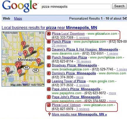
I am sure that most you saw the screen shot of Local OneBox test that Paul Jahn posted at searchengineguide.com (and was discussed by Greg Sterling) which shows the OneBox with 10 listings instead of the current 3:

There are several points of interest in the test.
•The space allocated at the top of the page is only about 1/3 more than currently allocated with the 3 listings.
•This is done by having less information and fewer links for each listing. They may also be using a smaller type face.
•The new result also adds 14 additional links into Maps. I had wondered recently, how much more traffic Google could send to Maps by adjusting links, obviously a lot more if they want to.
•It is also of interest that the reviews are emphasized as opposed to directions in the current OneBox.
It has never made too much sense to me to only highlight 3 local listings in the OneBox. Why 3 instead of 5, 7 or 11? The question for Google is: do the top 10 local listings provide more relevancy than 3 local + the organic results. My inclination is to say yes as my perception is that Google’s local results have improved over the past year.
The question for the business owner is why 3? Why should some businesses be rewarded and not others? Why not mine? Will the number vary by geography or industry?
I am glad to see Google testing this as there is no good reason for just 3. Determining the “right†number is another question altogether. At some point their value to the business owner though is diluted by the quantity and the viewer may be distracted as well.
© Copyright 2025 - MIKE BLUMENTHAL, ALL RIGHT RESERVED.
Comments
5 Comments
Hey, thanks for the mention Mike and great post!
The space allocated is probably even less. To meet image specs at SEG, I narrowed the window to under half the screen width before I took a screenshot. In a full size window, A-J is almost always just a single line.
Hi Paul
So you are saying it is almost a third less again…how did it compare to the Map Image Size when viewed full width? Was the font smaller?
Mike
Good question. Looking at Greg’s Screenwerk comparison, it looks like the font is the same. There just aren’t any spaces between the listings. The font didn’t change when narrowing the screen.
I wish I could compare the two, but only the “ten” results are shown still in tundra-land.
I really like your “review over directions” reference – something that didn’t dawn on me at all.
Hi Paul
Thanks for looking. I guess time will tell.
On the reviews issue it is also of interest that when there were no reviews it provides a “more” button instead. There is no address and the pin is also smaller.
Mike
[…] speculated in my last post that it was taking up something less than 1/3 more room. It actually is only occupying 10% more […]
Comments for this post are closed.