Understanding Google My Business & Local Search
Google Maps & Places Tidbits
Google Maps Enhances Interface
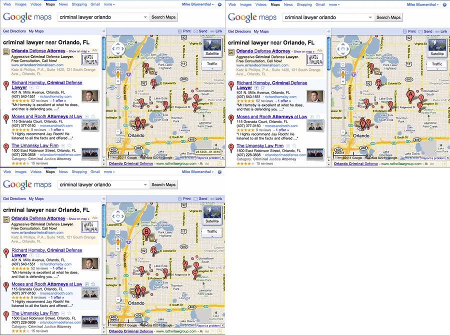
Yam Regev pointed out that Google Maps has upgraded the UI twith a stacked image and a fluid visual roll over that highlights the listing the pin highlights on the Map:

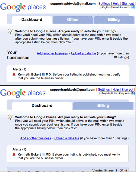
Offers Tab Removed WorldWide
Update from Google: To clarify, we have not removed the Offers tab for any regions — this tab has only been available in Google Places for businesses located in the U.S. since it was introduced a few years ago.
The Offers tab has been removed from Places for every country outside of the US. One can only speculate the reason but I assume that it portends an upgrade to their Offers product line. If you have created a free Places coupon in the UK the only way to currently access or edit the coupon is to change the country flag in the drop down.

© Copyright 2026 - MIKE BLUMENTHAL, ALL RIGHT RESERVED.


Comments
7 Comments
Mike, Yam: I didn’t see at all from my perspective. I looked at it 3 ways; changing my location from my locale; Washington, DC, then to the United States, then to Orlando, Fl.
The view was static; nothing was highlighted and the map didn’t float down the page as I looked at the “mixed results. By the time I was looking at letters C, D, E etc on the mixed rankings the map was out of the view screen.
Could be a test visual presentation in certain regions and being delivered by certain data centers and not in others. Just not seeing it.
Earl
Do you see “stacked” thumbnails inside of the list view in Maps? Might just be a test but the fact that I am seeing in Orlando and Yam is seeing in Europe implies to me that it is rolling out..
Ahhhh…..the Maps.google.com view. My mistake.
Frankly from a business perspective if its not strongly visual on the first page of Google.com….it doesn’t grab my attention.
OTOH if this is the view that dominates Mobile presentation than it gains in importance and is significant. Gotta get out and check it on my cell (that is soooo smart its smarter than me 😉 )
@Earl
It is interesting because tests in Maps will oft times make it to the main SERPs.
Do you find this roll-over feature to be of any real significance? Really? And what of the stacked thumbnails? Why would this be important? I could not unstack them. These UI changes appear to be ramping up for a new offers feature which will no doubt be broken upon release. We’re all quite excited about it. [Dammit – Why am I so negative?]
If we could roll over a business and the balloon got bigger and up popped a stack of “offers” that we could click on to see what deals were in the neighborhood – Now THAT would be exciting. If Google got paid per click on an offer – that would make sense. Viewing competing offers without even clicking on websites or Places pages – that would be sweet for SMBs and customers too – but then we’re back to an affordable flat rate fee scenario for Google. Hm.
Dear Google – Please do not attempt to brand this new thing you are creating. Do not try to be unique – just be innovative and let us call a coupon a coupon or an offer an offer and let us run with it. Thanks.
@Jeffrey
At this point I would not assign much importance to the feature thus the title: Google Maps & Places tidbits.
For me, noting a given change provides me with “memory” in the future if the feature ever has signficance.
That being said it is interesting to me that they are still experimenting with the Maps UI and if like you, they conceive of the value, maybe some day it will amount to something that goes main stream with significant value. In the meantime they need a place to play and I see Maps as currently fulfilling that important function.
I totally agree with you, Mike. not all the UI changes that Google is doing to their products need to be bombastic & shocking. I think it’s good & nice to see small things getting touch ups. when you see such stuff you know that things are live & kicking.
BTW-
1. Also, I’ve noticed that above the peg man, the “Show My Location” button got back. (or is too late in Israel now (03:00 AM), so my focus & memory are both tricking me 🙂 ).
2. In Europe, as far as i can see at this moment, the UI changes are a bit different: when hovering over a listing, the red pinpoint is turning flashy & getting bigger (like a swollen balloon) till its max size.
Yam Regev
Comments for this post are closed.