Understanding Google My Business & Local Search
Google Jazz Interface and the 7 Pack Are Evolving – How will it affect organic display?
The new Google Jazz interface has received another facelift (thanks Barry) and continues to evolve. Initially the new interface, which was rolled out on a very limited basis in November, was showing only a 5- Pack of local listings. Earlier this month it was modified once again to show the 7 Pack. The new tweak cleans up the interface by eliminating the color block and a number of menus along the left hand side.
I was curious how the display in its current configuration affected the presentation of local and organic search results on a range of displays. The Google result page scales from just over 800 pixels to just under 1280 pixels. In the 800 range, things are cropped and above 1250 pixels or so it stops scaling. What will then show to whom on the new display?
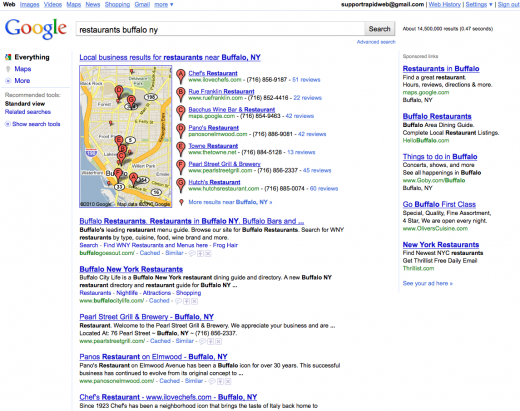
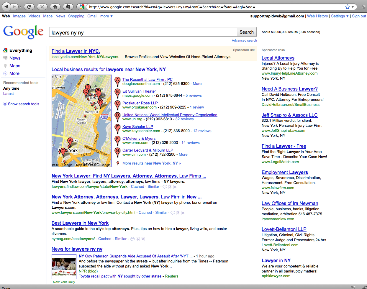
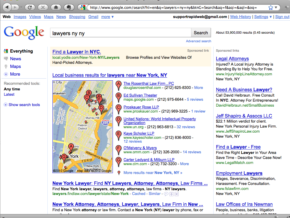
I have captured images at pixel widths of 800, 1024 and 1280 both with and without sponsored ads at the top of the display to determine what will show. For the purposes of the capture I shut off tabs and other enhancements that a typical user is unlikely to be using. According to w3schools.com 76% of browsers are displaying at more than 1024×768 resolution with only 20% at 1024×768 and 1% at 800×600. Even if w3schools stats overstate the actual resolutions due to the sophistication of their audience, their trend line is accurate and it shows 1024 heading to oblivion within the next few years and 800 x 600 nearly there.
Here is the new Jazz interface at 1280 x 1024 with sponsored ads at the top. In this view (which over 76% of users will see) there are still 3 organic results plus a universal result showing (click to view the images at full resolution):
In the worst case scenario of a 1024 x 768 display with sponsored ads at the top the user will see two organic results:
To see all of the screen captures at resolutions from 800 on up……
Here are all of the screen captures in a slide show format from 800 to 1280 with and without sponsored ads at the top for your viewing.
In the more typical view at 1280 without no sponsored ads at the top, the page will show 5 organic results:

My assessment is that with growing screen sizes, Google has made the appropriate compromises to insure that a reasonable number of organic results show above the fold with the new design. Certainly the Local 7 Pack still dominates but there will still be room for both organic and local information on a local search with the current design.
© Copyright 2026 - MIKE BLUMENTHAL, ALL RIGHT RESERVED.


Comments
7 Comments
This looks promising. Any idea when this goes live?
Also how were you testing this?
Thanks for the amazing info as usual.
-Nick
Found it, just had to do a bit more digging. 🙂
Mike,
Nice to see a post from you! It’s been a little while.
The screenshots are great, but I’m still not loving that left nav. It seems like such a waste of space.
Hi Miriam
I decided to abandon the avalanche of local consulting, local web design and local seminar planning and start writing again…
I have been using the Jazz interface and in the end you (or I don’t) don’t notice the left nav and I think this change is cleaner looking that the previous iteration.
@Nick
My understanding is that it is being tested more broadly now and that it will become more common over the next month or so…
The instructions to try it are here.
[…] Google Jazz Interface and the 7 Pack Are Evolving – How will it affect organic display?, Mike Blumenthal […]
“I decided to abandon the avalanche of local consulting, local web design and local seminar planning and start writing again…”
Financially, I have to say, this is a terrible decision. Are you not happy with your LocalU equivalent hourly rate of $1.74? Perhaps we should offer our next speaking slot to an Eastern European comment spammer? 😉
@David
Au contraire…I am very happy (?) with the pay ….I just decided to throw caution to the winds and be wild and crazy
Comments for this post are closed.