Understanding Google My Business & Local Search
Google Updates Mobile Travel Experience with Additional Planning Features
Early in February Barry Schwartz reported that Google had rolled out a new mobile travel search experience that made provided a very deep “click in” experience on Google.
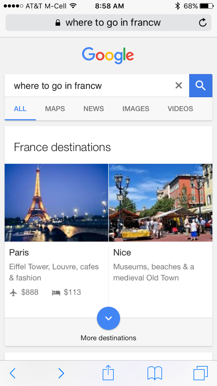
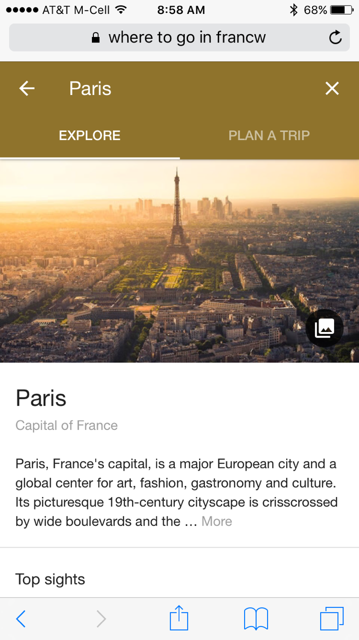
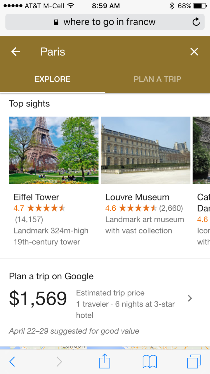
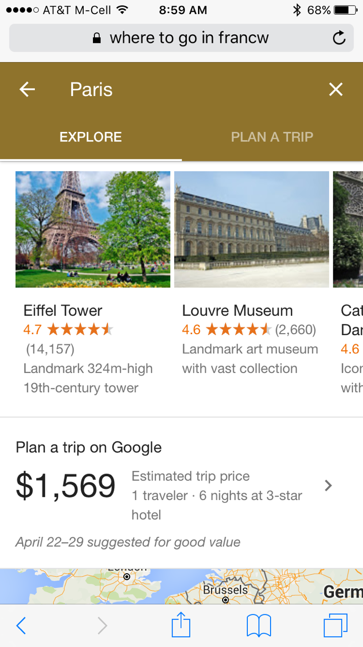
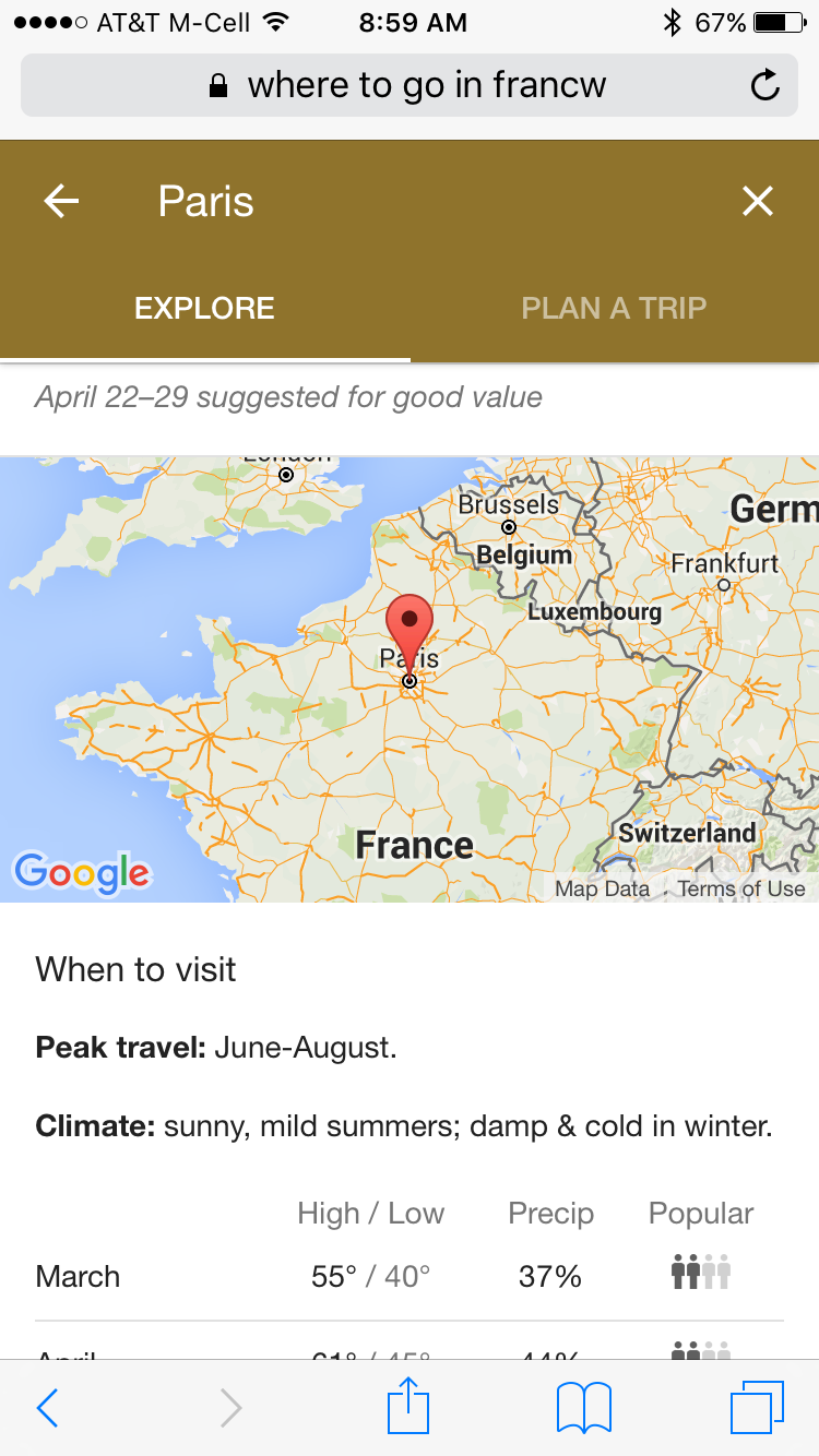
On a search like “Where to go in France” Google offered tiles in the main search for significant cities that when clicked took you to a list of destinations for that country and when a city was selected offer single page of travel related answers for that city.
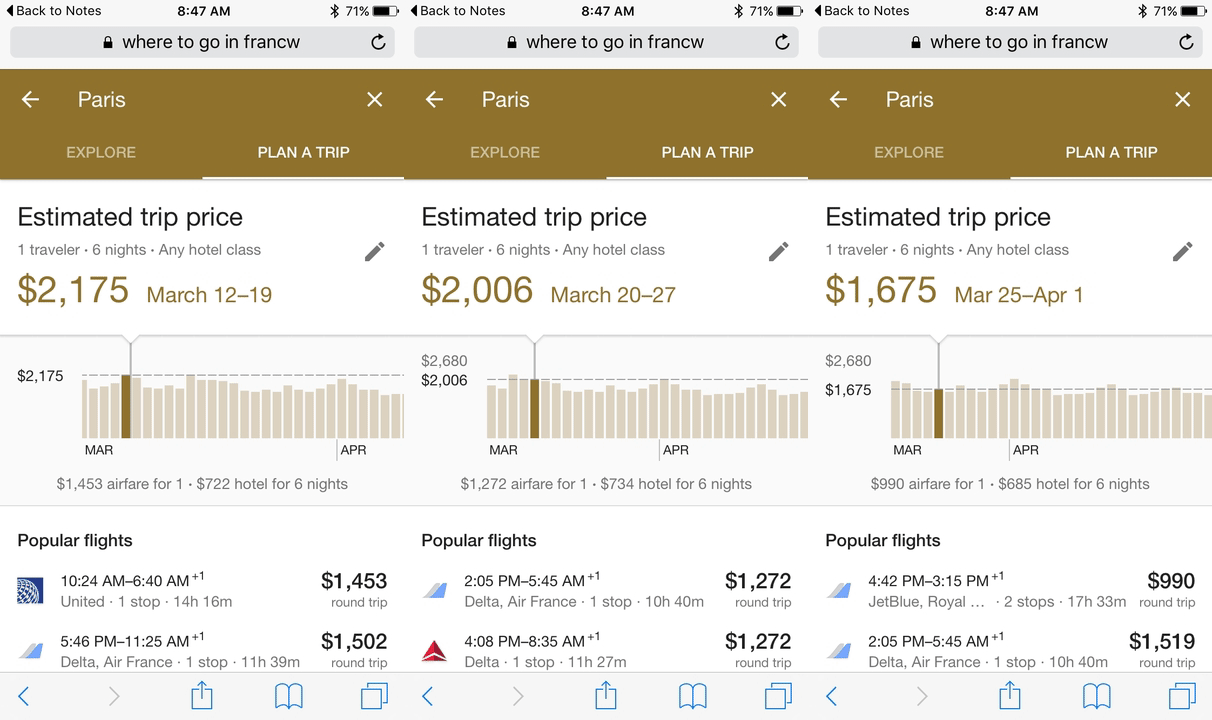
It appears that since this feature was first reported on SearchEngineland, Google has expanded the features of that page by separating the functionality into exploring and planning. In the new plan a trip tab they offering a new, animated cost planning interface that details the average costs for hotel plus airfare at different times of the year.
This is truly a rabbit hole experience and lays out a clear path of Google not just providing the answer but of capturing all of the attention and attempting to book the trip as well.
The experience starts in search, clicks into a scrollable list of destinations and then proceeds into screen after screen of content and detail.
© Copyright 2025 - MIKE BLUMENTHAL, ALL RIGHT RESERVED.

Comments
7 Comments
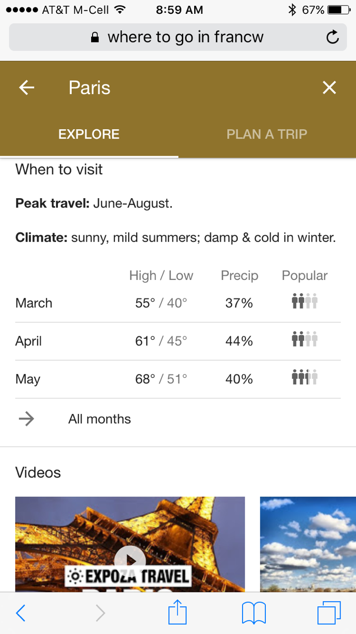
Hmmm I do kinda like the feature as a user searching for information about a location. The data it shows is pretty unique and interesting for travellers such as
1) when to visit
2) peak travel time
3) climate
4) breakdown by month for temperatures and popularity
The images shown all appear to be very high quality and the selection of related videos also seem mostly good so I assume these are still manually created?
It’s also interesting that it seems to be only able to be triggered when doing a country search not a city search…
My understanding is that the next step has Google sending over a car to pick you up… then they just take over, and you follow along on the journey
I tried it out, and I do like it – it’s slick.
However I couldn’t get past this page to ‘consider’ booking a (really well priced) flight to Manila googleflights.flightnetwork.com
Perhaps it’s because I’m in Canada?
@David
I was able to get it to show on a state level result like “where to go in Virginia” although not on all of them but I too could not get it to show at a city level,
At the city level I saw a vertical carousel of POIs. that being said, the carousel stays at the top of the search window and in prime territory encourages long term engagement.
@Andy
Not sure I know the answer…
Indeed, the fact to display climate information, attractions, best time to visit is interesting. This reminds me Travel Seeker HD from Amadeus (launched 4 years ago in 2012): https://www.youtube.com/watch?v=rnbouTRzr8Q
It great to see someone taking a real user view of the travel experience. OTAS have dominated travel marketing and they have a very conventional approach to price and facilities. The result is an information dump that does not help those who are looking for advice and suggestion based on personality. That is the next big move in travel planning
I love the sliding price scale so you can see the best time to visit. It has been really hard to do that up to now on other travel websites. Google really do spend a lot of time on attention to details.
Comments for this post are closed.