Understanding Google My Business & Local Search
Google Updates Mobile Pack Display
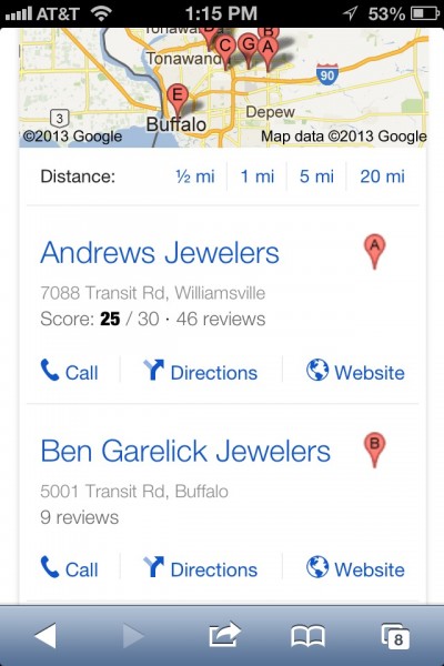
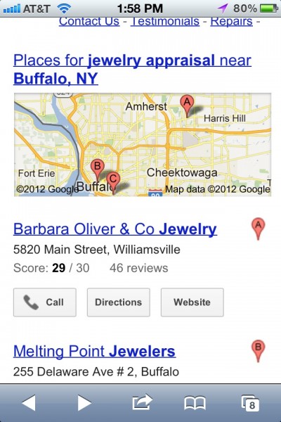
Google might have updated the mobile local Pack display a while ago, who knows, but it seems to me a fairly recent change. The change makes for a more modern, cleaner business listing display.
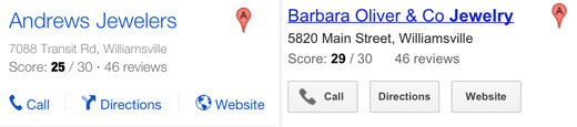
The font size of the business name is larger and the buttons are subtler and now incude an icon for the action to be taken. The actual amount of space used is almost identical but everything seems larger to the eye. A subtle but effective change. It is interesting but in this context the map with the red pins are starting to seemed dated in appearance.
Here is a comparison of new and old display side by side (note the emphasis on the brand):
Because I so quickly forget what things looked like previously I am including a screen shot of the mobile local pack display that preceded this change. (Let me know if you happened to notice when this change happened):


© Copyright 2026 - MIKE BLUMENTHAL, ALL RIGHT RESERVED.
Comments
10 Comments
I can only speak on behalf of the UK, but I believe this changed rolled out approximately 48 hours ago. I know this as I’m constantly doing searches on the Mobile – this is primarily me checking up on clients rankings progress. What I can confirm is that at the start of this week (or Sunday 17th February evening), we still had the old display. I think it may of changed on Tuesday or Wednesday. Anyway, thank you for reporting it – I agree that it’s an effective change and makes the local results far more prominent.
I don’t ever remember seeing the “Distance” option on the top of those mobile local web search results. When I did a search just now on my phone I chose 5 miles and it returned the old style of results and took me to “Places” instead of “Web”.
Would it be safe to assume that anytime Google rolls out a new look for a particular SERP that it is associated with a change in the way they return the results as well? Whether at the same time or around the same time?
@Ben
The distance option is a faceted search option that appears when you are searching in an area other than your actual location and/or Google Maps does not know your precise location (perhaps because you haven’t allowed it).
The distance option has been visible for several months (although still relatively new). As you noted when you choose it, it then takes you over to Places results that are still using the old style display. So I guess you can not assume that the new look is associate with a change in the way that they return results as they did not happen simultaneously.
@Mike – Thanks for clarifying that for me. I appreciate that.
@Nick
Thanks for confirming that I am not crazy. I thought I checked about a week ago but didn’t have a screen shot to verify my sanity against. I hate announcing new and shiny things that aren’t new and shiny. 🙂
Mike – Just want to thank you for all of your hard work through the constant evolution that is Google Local…I have been creating/managing listings for clients for 5+ years and can always count on you to share a huge tip or to validate my own findings – so thanks & kudos for your diligence. Last I knew, there was no option to leave a G+ review from mobile. Anything new & shiny on that front?
@John
The only current mobile review option is via app but not via the general web interface.
Thanks for also verifying that I’m not crazy, Mike. It definitely wasn’t looking this way on my iPhone as of a couple days ago.
I like the new look. Not sure Jakob Nielsen would like it, though (no underlining on the links).
I find the new version of text a bit washed out, and the bolded text to be too dark. I like the blue (links) though – they look a bit thinner and more modern 🙂
If you come from the iOS world more than Android, you might not have realized: this is one of many changes that are bringing various SERPS to match the style of Google Now cards, as seen in the latest versions of Android. I’ve recently noticed that searches for “weather” on the desktop finally show as a Google Now-style card, too.
Comments for this post are closed.